filmov
tv
Times New Roman vs Comic Sans - Animated

Показать описание
Hey all!
This has been suggested so many times and I really wasn't confident in a concept until now, so thank you for being patient if this has been on your wishlist for a while now! Oops time to watch Brennan Lee Mulligan threaten the very existence of Zac Oyama, but also they're pretending to be fonts too I guess.
Hope you enjoy!
Here are my other Animations:
Thank you to all my Patreon supporters who continue to enable the amount of work I produce!
Thanks for reading, watching and hopefully enjoying!
Times New Roman vs Comic Sans - Animated
Meeting Between Times New Roman And Comic Sans
Make Some Noise - Brennan can embody anything
Brennan's Villain Monologue for Times New Roman (from 'Make Some Noise')
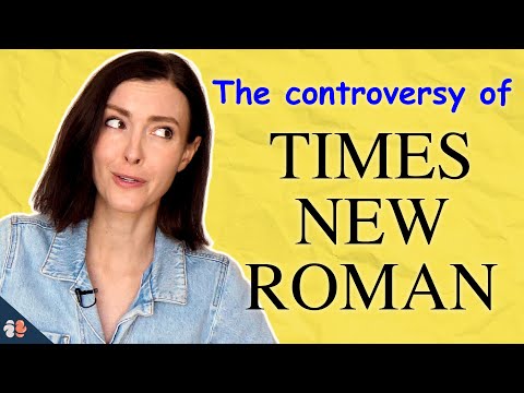
Why You Should Stop Using Times New Roman (Research Explains)
Brennan Lee Mulligan's Closing Remarks - Game Changer Animated
Why you shouldn’t make a resume in Times New Roman
The Brennan and Ross Accent-Off - Animated
A Defense of Comic Sans
The Devilled Egg on Zac's Shoulder - Game Changer Animated
The McDonald's MacBeth Sandwich - Animated
Brennan as a Dom DM
Brennan Lee Mulligan Loses It - Game Changer Animated
McDonald's Newest Sandwich - The MacBeth 🍔
A Problem Player In D&D
Brennan Lee Mulligan Teaches The Birds and The Bees - Animated
Dueling Anime Characters Over-Explaining Every Move
Times New Roman— Graphic Design History 101
Mr Mayonnaise - Animated
Brennan's Wario, Wennan Wee Wulligan
Harry Potter Makes Zero Sense
Comic Sans* just got a serious upgrade
Catty Teans Roast Sam's Outfit
Fonts hanging out - Elle Cordova (full compilation)
Комментарии
 0:01:49
 0:00:55
 0:01:41
 0:00:55
 0:10:03
 0:01:34
 0:00:45
 0:01:45
 0:09:53
 0:01:40
 0:01:18
 0:01:00
 0:02:20
 0:01:00
 0:00:49
 0:02:00
 0:01:00
 0:09:07
 0:01:48
 0:00:50
 0:01:00
 0:22:28
 0:00:59
 0:04:13