filmov
tv
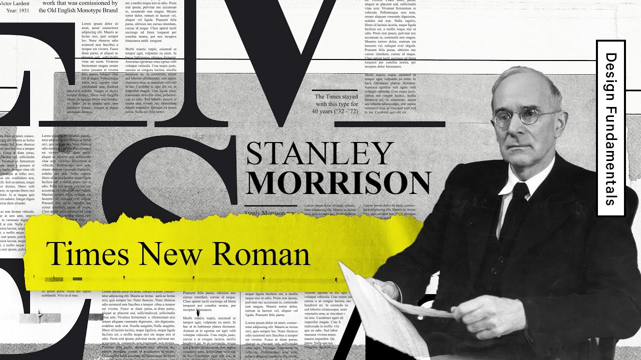
Times New Roman— Graphic Design History 101

Показать описание
How did Times New Roman become the default typeface we all use? Born out of anger, selected for its economics, and adopted because of its accessibility. In this video, we dive into the history of the Times New Roman typeface, how it came to be, and why is it such a staple from congress to college.
00:00 - Intro
00:29 - The History of Times New Roman
01:25 - Why Times New Roman was Designed: Legibility
04:35 - Cost: The reason why Times New Roman became Popular
06:10 - Times New Roman Became the Default because of Availability
08:38 - Credits
#typography #graphicdesign #history
===
#TheFutur #1BminusOne
Want a deeper dive? Typography, Lettering, Sales & Marketing, Social Media and The Business of Design courses available here:
—
Love the content? Become a sustaining member for $5/mo today.
Our recommended products and Booklist:
Kits & Proposals:
Visit our website:
FREE resources:
Mandarin (Chinese) Subtitles on UiiUii
—
AFFILIATE LINKS*
🙏 Support The Futur but purchasing through our affiliate links:
✍️ Sharpen your skills by taking a course, using our affiliate links:
🎧 Do you like the music? Check out the music libraries we use in our affiliate links below:
*By making a purchase through any of our affiliate links, we receive a very small commission at no extra cost to you. This helps us on our mission to provide quality education to you. Thank you.
—
Futur Podcast on iTunes: 🎙
Spotify: 🎙
—
We love getting your letters. Send it here:
The Futur
c/o Chris Do
1702 Olympic Blvd.
Santa Monica, CA 90404
USA
—
Host– Ricky Lucas
Content Director– Matthew Encina
Producer - Mark Contreras
Cinematographers– Ricky Lucas, Jona Garcia
Editors– Ricky Lucas, Jona Garcia
Live Editor– Jona Garcia
Social Team– Elle Money, Alex Burlui
Typefaces: Futura, DIN, Helvetica Neue, Calibre, Champion Gothic
Futur theme song— Adam Sanborne
Комментарии
 0:09:07
 0:01:00
 0:12:09
 0:00:39
 0:10:03
 0:00:14
 0:07:27
 0:00:57
 1:13:22
 0:01:01
 0:08:10
 0:03:36
 0:00:57
 0:13:59
 0:00:14
 0:00:14
 0:00:18
 0:00:24
 0:01:06
 0:00:14
 0:00:16
 0:01:01
 0:00:25
 0:00:06