filmov
tv
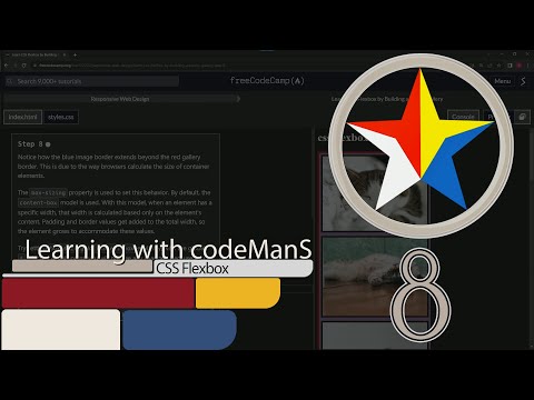
FreeCodeCamp | Learn CSS Flexbox by Building a Photo Gallery: Step 8 | Responsive Web Design

Показать описание
📦 **"Crafting Boundaries: The Dance of Dimensions in Digital Design"** 📦
In the intricate ballet of web design, every pixel dances in harmony with its neighbors. But what happens when the dance floor extends beyond its designated area? This is where our understanding of space, dimensions, and the canvas comes into play.
✨ **Understanding the Canvas**:
Step 8 introduces us to a cornerstone of CSS – the box model. Picture an artist's canvas. When they are promised a certain size, they don't expect the frame or the borders to intrude upon that space. Similarly, in the world of web design, when we assign a width to an element, we mean just the content. But there's a catch – browsers, by default, add padding and borders to this width.
🎨 **The `box-sizing` Conundrum**:
This is where the power of `box-sizing` steps in. By default, it's set to `content-box`, which means the width we set is only for the content, with the padding and borders adding to it. If you've ever wondered why your designs aren't aligning the way you envisaged, this could be the culprit.
By setting the `box-sizing` property to `content-box` explicitly using the global * selector, we're merely reiterating the browser's default behavior. It's like gently reminding the universe of its natural order. Yet, this step is crucial for understanding, especially when we wish to change this behavior in future designs.
Join us on this introspective dive into the nuances of design space, where we understand the symphony of dimensions, and learn to guide every pixel to its destined place.
#TheArtOfBoxSizing #DesignSymphony #Step8Insights 📦✨🎨🖼️
📚 Further expand your web development knowledge:
💬 Connect with us:
Комментарии
 0:35:53
 1:25:39
 0:48:43
 0:08:16
 0:08:08
 0:09:15
 0:01:56
 11:08:10
 0:01:06
 0:01:27
 0:01:32
 0:03:01
 0:21:10
 0:20:13
 1:02:44
 0:01:32
 0:00:54
 0:01:47
 0:09:26
 0:00:49
 0:02:07
 0:43:23
 6:18:38
 0:00:56