filmov
tv
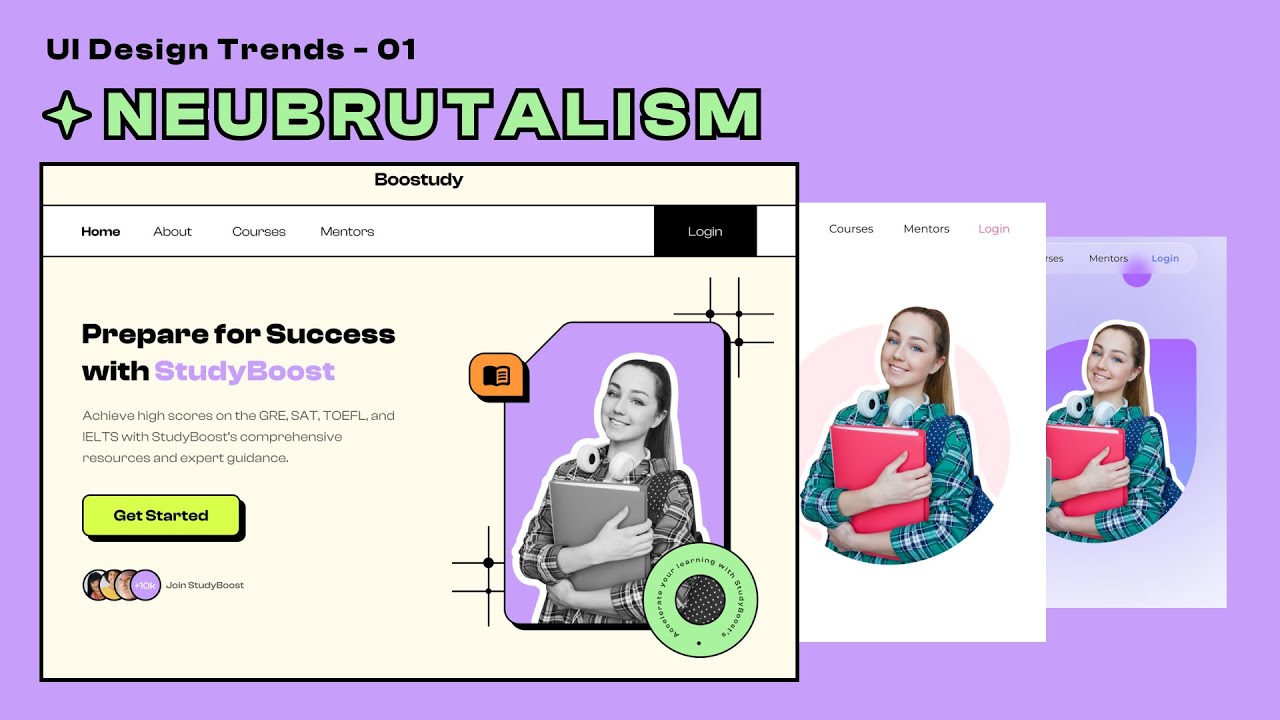
UI Design Trends 01 | Neubrutalism

Показать описание
Hello guys!
In this video, we're going to talk about 'neubrutalism.' As promised, I'll be making videos about different UI design trends, and this is the first one. A lot of viewers have been asking for this too. Neubrutalism has some unique features that make it easy to recognize. The first thing you'll notice is the use of bold and contrasting colors, big text, and shapes with straight lines. Objects are outlined with black lines and have solid dark shadows without any blurry effects.
#ui #trends #neubrutalism
-------------------------------------------------------------------------------
Source File:
----------------------------------------------------------------------------------
Contact Us:
or
Visit our website:
----------------------------------------------------------------------------------
Follow us:
Visit our website:
Facebook:
Page:
Group:
Join our Facebook group for curated content, inspiration, design critique, and job postings:
Join our Webflow group.
Instagram:
@designsense99
Dribbble:
Комментарии
 0:15:01
 0:07:12
 0:07:01
 0:10:17
 0:03:04
 0:06:53
 0:10:58
 0:11:44
 9:39:03
 0:00:19
 0:05:05
 0:04:39
 0:11:33
 0:09:00
 0:13:14
 0:10:04
 0:00:21
 0:07:34
 0:00:59
 0:11:05
 0:00:16
 0:00:35
 0:01:01
 0:20:26