filmov
tv
Level up your UI design skills in 7 minutes! | EP1

Показать описание
P/S: The last screen should be Name on Card and Card Number. Apologies for the mistake as this was all done under 1 hour :)
The result showcase is made with Rotato. After prototyping with Figma, I use Rotato for the 3D animations.
| Links
| Let's be fwens!
| Watch next
| Chapters
00:00 The Redesign Challenge
00:40 Critique (Payment method screen)
02:15 Critique (Add card screen)
03:00 Thought process
05:50 Final touch up
06:20 The result
| Disclaimer
Some of the above are affiliate links—I make a small commission when you purchase through my link, at no extra cost to you. Thank you for supporting an independent creator!
 0:07:12
Level up your UI design skills in 7 minutes! | EP1
 0:12:05
Level up your UI design skills in 12 minutes! | EP2
 0:44:07
Level up your UI design skills Start learning Design Systems #productdesign #designsystem #tutorial
 0:04:16
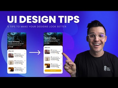
5 Tips to improve your UI Designs
 0:00:21
How to level up your design skills (visual, UX, UI)
 0:11:05
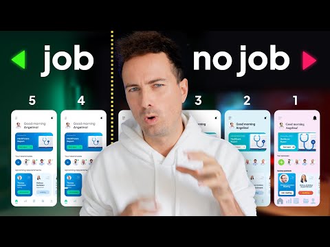
5 levels of UI skill. Only 4+ gets you hired.
 0:03:19
3 Ways to Level Up Your Visual Design Skills
 0:11:11
6 UI Hacks I Wish I Knew As A Beginner
 0:10:44
The Ultimate Guide to Samsung’s One UI 7 Features!
 0:07:09
Ultimate Guide to UI Design
 0:10:57
Are You At Least at Level 4 of UI?
 0:20:46
Amateur vs Pro UI Design | with examples
 0:10:23
Master Spacing in UI Design 💪
 0:06:53
world's shortest UI/UX design course
 0:00:40
The Fastest Way To Level Up Your Web Design Skills
 0:01:41
This simple mindset shift made me a 10X better designer.
 0:00:19
Banking App - Sketch to UI Design Process
 0:00:58
3 Tips to Level Up as a UX/UI Designer!
 0:08:23
6 Stages of UI Design
 0:33:23
Become a SENIOR UI/UX Designer – How to Level up in CRAFT
 0:00:21
Figma | Testing Prototype with Figma Mirror | #figma #uidesign
 0:10:09
Get above UI Design Level 4 FAST!
 0:10:39
Level up your designs with UI Kits, design systems and more
 0:02:38
Level Up Your UI Design with Toggle Button Animation in Figma
Комментарии