filmov
tv
Dynamic Variance Analysis with Power BI - Different Forecast Versions Comparison

Показать описание
When I was first started my journey with Power BI, I always struggled to create visualization for showing the variances between different budget/forecast versions. Things are always done manually in Excel as I'm only able to total up the different versions and manually substract them in a spreadsheet. I'm able to find videos and tutorials about actuals comparing against budget and previous years, but not something about comparing different forecast versions and where you can change dynamically
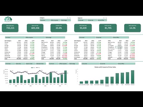
After some research and self-studying, I am finally able to create a dashboard specifically for comparing different forecast versions against one another dynamically with Power BI.
In this video, I will share the steps to setup your data model from scratch so that you can achieve similar outcome with Power BI and you can compare all the different forecast versions you have in the archive easily.
00:00 Introduction
00:17 Data Model Example
01:30 Step 1 - Create an index table containing all unique forecast versions
02:48 Step 2 - Create a copy of forecast versions table to be used as the comparison
03:08 Step 3 - Create slicers for users selection
04:13 Step 4 - Create all measures required to calculate variances and using matrix visual for data validation
06:17 Setup Bar Chart to visualize variance
07:07 Setup Waterfall Chart to visualize variance
07:35 Setup Line Chart for trend analysis and visualization
08:22 Trailer for future videos - Comparison against multiple versions all in a single table
08:34 Thank you and see you!!
PBIX file used in the video:
MY FAVOURITE GEAR
Disclaimer:
Do note that this is the way I built my data model and it is by no means the only way or the most efficient way to do it. If you have better and more efficient way to achieve the outcome, feel free to comment and let me know about it.
#PowerBI #VarianceAnalysis #ComparisonReport #DynamicVarianceAnalysis #Variance Analysis
🤝 BE MY FRIEND:
🙎🏻♂️ WHO AM I:
I'm Joel, an analyst working in Singapore. I make videos about technology, automation and productivity.
📧 GET IN TOUCH:
Комментарии
 0:09:03
 0:22:23
 0:01:45
 0:08:01
 0:10:31
 1:10:57
 0:08:14
 0:08:59
 0:08:12
 0:07:28
 0:13:31
 0:09:48
 0:09:33
 0:10:26
 0:50:48
 0:40:32
 0:35:28
 0:05:15
 0:20:59
 0:45:05
 0:30:37
 0:06:52
 0:09:56
 0:15:01