filmov
tv
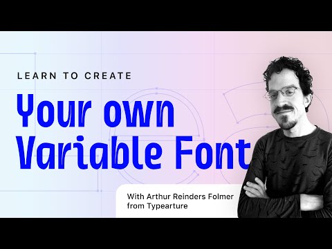
Making your first variable font in Glyphs font editor

Показать описание
It can be a little daunting to approach font design, but it doesn’t have to be! Glyphs is an amazing font editor that makes it really easy to get started. In this video, I give a quick intro to the program, and run through the basics of drawing and exporting a working variable font.
In case you’re curious: no, this video isn’t sponsored. I got a question about this the other day, and realized that it would be a nice topic for a quick video!
Apps mentioned:
Contents:
0:00 Intro
0:19 A look at a full font example
1:10 What makes a variable font work? (Interpolation!)
2:47 What is a variable font, anyway?
3:50 Why Glyphs is a good choice for making your first font
5:55 How to start drawing your font: control characters
7:11 Using the Pen tool to draw a letter
13:00 A look at setting basic font info
14:10 Setting up the 2nd drawing for a variable Width axis
15:45 Moving between the master drawings
16:56 Editing the second drawing
18:28 Thinking about the different spacing for each drawing
19:48 Setting up the variable font axis
21:09 Exporting the font
21:34 Testing the font with Font Goggles
22:17 Main gotcha: contour compatibility
22:55 Adding instances/styles to test interpolation while drawing
25:54 Bonus: making a “Height” variable axis
29:05 Testing the Height axis
29:20 Conclusion
Комментарии
 0:30:14
 0:21:44
 0:13:30
 0:04:49
 0:31:47
 0:03:30
 0:02:25
 0:01:00
 0:16:29
 0:48:06
 0:47:29
 0:55:07
 0:14:18
 0:58:56
 0:19:16
 0:16:50
 0:23:11
 0:15:23
 0:11:44
 0:20:10
 0:48:38
 0:57:51
 0:00:08
 0:18:38