filmov
tv
Using geom_line to change the appearance of a line plot with ggplot2 in R (CC097)
Показать описание
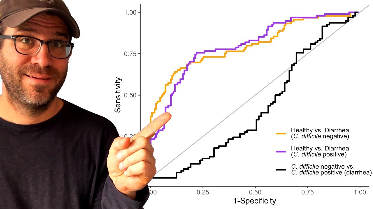
Have a boring line plot? Pat uses geom_line from the ggplot2 R package to walk through how to make attractive (and ugly) line plots in this episode of Code Club. Pat will modify a figure with a set of receiver operator characteristic (ROC) curves to change their thickness, pattern, color, and how line ends and segments are joined together. Finally, he'll bring it all together to make an attractive (and kinda ugly) figure.
Do you have a figure that you would like to receive a critique or help improving? Let me know and I'd be happy to arrange a guest appearance!
You can also find complete tutorials for learning R with the tidyverse using...
0:00 Introduction
1:49 ROC curves w/ geom_line
2:40 size parameter
3:33 linetype aesthetic (w/ numbers)
5:39 linetype aesthetic (w/ words)
6:25 color and group aesthetics
8:03 An experiment
10:32 lineend and linejoin parameters
12:42 Improving appearance of figure
20:11 Experiment!
 0:21:18
Using geom_line to change the appearance of a line plot with ggplot2 in R (CC097)
 0:05:03
GGPlot - Lines with GEOM LINE, GEOM PATH, GEOM STEP
 0:05:16
Plotting longitudinal data with geom_point() + geom_line() | Professional dataviz with ggplot2 | R
 0:09:31
Geom Point, Line, and Errorbar Publication Quality Plotting using R and ggplot for Biologist
 0:04:33
Multiple lines in geom_line command | ggplot2 package | adding more than one line + annotate command
 0:31:39
Adding text to ggplot figures to annotate your data with geom_label and geom_segment (CC068)
 0:08:16
GGPlot - GEOM AREA
 0:03:48
GGPlot - Scatter plot and GEOM POINT
 0:23:06
How to create alternating background colors in R with ggplot2 (CC137)
 0:04:43
Change Color, Shape & Size of One Data Point in Plot (Base R & ggplot2) | ifelse() & nro...
 0:22:54
PMAP 8921 • (9) Annotations: (2) Text in plots
 0:25:01
Line charts and Connected Scatterplots in R with geom_line() and geom_path()
 0:00:16
can I play Geometry Dash on a dumbphone? #shorts
 0:11:48
GGPlot - GEOM SEGMENT
 0:04:54
GGPlot - GEOM CURVE
 0:01:16
R : How to change the line thickness of whiskers using stat_boxplot(geom = 'errorbar')
 0:11:08
Introducing aesthetics and geoms
 0:00:19
How to Use Your Save in all Geometry Dash Games!
 0:07:45
Enhanced scatterplot : Side plots in ggplot2 using geom_*side^() of ggside package
 0:19:47
Adding lines and asterisks of statistical significance on a figure with ggplot2 (CC093)
 0:01:40
GGPlot - GEOM JITTER
 0:00:11
Geometry Dash 3D 😂 #shorts
 0:00:25
One Simple Step to Make Your Levels 100% Better
 0:00:17
kwon jae sung transformation💀 #shorts #kwon
Комментарии