filmov
tv
How to create alternating background colors in R with ggplot2 (CC137)

Показать описание
Putting rectangles with alternating colors in the background of a figure is not obvious in R. But if you implement these colored strips, they can be an attactive way to repalce gridlines. The alternating colored strips can help your audience see what data go together. In this episode of Code Club, Pat will morph a figure he made that was originally creaed by Ipsos to a more stylized one published by chartr. The data depict the percentage of people in 15 countries who would be willing to receive the COVID-19 vaccine as of August and October of 2020.
You can also find complete tutorials for learning R with the tidyverse using...
0:00 Introduction
6:40 Use geom_ribbon to create colored background strips
11:49 Represent three different colors in strips
14:48 Convert y-axis from plotting discrete to continuous values
17:21 Remove extra padding between axes and axis labels
18:19 Put y-axis tick marks between country names
21:59 Recap
 0:23:06
How to create alternating background colors in R with ggplot2 (CC137)
 0:01:45
Apply Color To Alternate Rows In Excel 365 Using Conditional Formatting
 0:02:33
How to apply color banded rows or columns in excel
 0:00:17
Alternating Color in Google Sheet - Google Sheet using Mobile - #gsheetWithRijwanul
 0:00:40
Automatically Color Alternate Rows in Excel: Quick and Easy Tutorial
 0:00:13
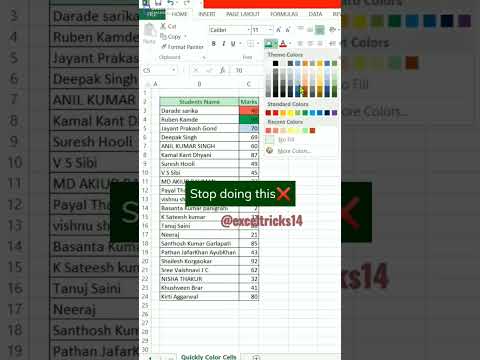
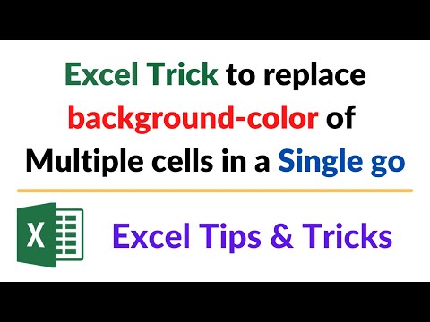
Shortcut to replace background color of multiple cells in excel | Quickly color cells formula
 0:00:45
Different wallpapers with dual screen setup
 0:09:58
How to make an alternating Desktop Background
 0:04:04
How to Apply Alternate Row Colors in LibreOffice Calc
 0:00:14
This Spining Effect Make Your Slides 10.000 Times Cooler!
 0:00:50
How to Make Alternating Row Colors in Google Sheets
 0:00:29
Shortcut to Replace background color #excelshorts
 0:02:55
ListView with different background at alternate positions
 0:01:30
Create Alternating Background Colors for Input Fields with :nth-child() in CSS
 0:01:51
How to Bubble: Alternating background color in Repeating Groups
 0:16:36
ADVANCED Matrix Formatting I ALTERNATE Column or Row COLOR in Power BI
 0:01:53
How to Alternate Table Colors in HTML and Maintain the Body Background
 0:01:13
HTML : How could I alternate background-color between odd/even dd rows
 0:00:28
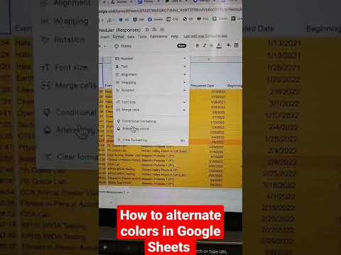
How to alternate colors in Google Sheets
 0:00:16
Free #AI Tools Alternatives
 0:10:11
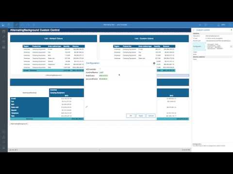
IBM Cognos Analytics - Custom JavaScript Controls - Alternating Background
 0:01:32
How to Put Color in a Table in Microsoft Word : Microsoft Word Doc Tips
 0:03:47
Gallery Auto Number, Alternating and Highlighting Rows | Power Apps Tutorial
 0:00:16
Geometry Dash Most ANNOYING Bug #geometrydash #gd #shorts
Комментарии