filmov
tv
Plotting longitudinal data with geom_point() + geom_line() | Professional dataviz with ggplot2 | R

Показать описание
5 minutes is enough to create a professional-looking and ready for publication chart. In this video i will show how to visualize longitudinal data using geom_point() and geom_line() functions from ggplot2 package.
The data used in this video is the 'Orange' dataset from 'datasets' package.
The data used in this video is the 'Orange' dataset from 'datasets' package.
 0:05:16
Plotting longitudinal data with geom_point() + geom_line() | Professional dataviz with ggplot2 | R
 0:09:31
Geom Point, Line, and Errorbar Publication Quality Plotting using R and ggplot for Biologist
 0:02:43
Draw ggplot2 Plot with Lines & Points in R (Example) | Add Scatterplot Line | geom_line & ge...
 0:18:41
Making Swimmer Plots for Longitudinal Data with {ggplot2}
 0:03:48
GGPlot - Scatter plot and GEOM POINT
 0:26:51
ggplot for plots and graphs. An introduction to data visualization using R programming
 0:13:28
How to draw a line graph using ggplot with R programming. Plots and graphs to visualize data.
 0:08:38
ggplot Scatter Plot, geom_point (first plot) - R Lesson 11 CradleToGraveR
 0:07:29
Rstudio:Beginners - what is geom_point and geom_jitter in ggplot in R.
 0:20:23
Scatterplots in R with geom_point() and geom_text/label()
 0:10:48
Introduction to ggplot2: Data Communication / Data Visualization
 0:12:04
Changing The Size Of Points In Graphs In Base R and GGPLOT2
 0:03:56
GGPlot - GEOM HLINE, GEOM VLINE, GEOM ABLINE
 0:18:46
How to Create Bubble Charts in R with geom_point() and scale_size()
 0:31:39
Adding text to ggplot figures to annotate your data with geom_label and geom_segment (CC068)
 0:35:49
Create Dumbbell Plots with Callouts in RStudio
 0:03:32
Specify Different Colors for Points that are Connected by Lines in a ggplot2 Plot in R (Example)
 0:01:57
Quick tip: How to add a border to geom_point in ggplot2
 0:08:44
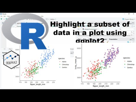
Highlight subset of data in a plot using ggplot2
 0:20:08
How to Create Line Charts with Points Using ggplot2 & plotly in R | Data Visualization Tutorial
 0:05:15
Data Visualization with R: Part 2
 0:25:01
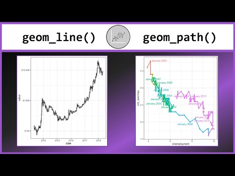
Line charts and Connected Scatterplots in R with geom_line() and geom_path()
 0:04:10
Scatter plot with ggplot2 in R (4 minutes)
 0:22:28
Scatter plot and Line plot in R (using ggplot2)
Комментарии