filmov
tv
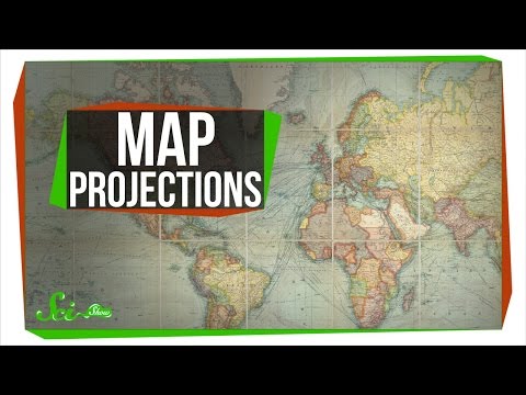
Mercator projection

Показать описание
Modeled and animated by Grafonaut. Video as part of a course by Emarin Norway. Explaining the sacrifices made to convert the earths spherical surface into a flat, navigable map.
Mercator projection
 0:01:00
All Maps Lie! The Mercator Projection, The Most Commonly Looked at Map In The World, isn't So R...
 0:06:00
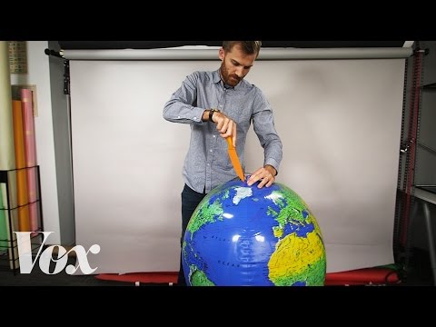
Why all world maps are wrong
 0:02:25
Mercator Projection Explained (Why Does Greenland Look So Big On A World Map)
 0:04:58
Why every world map is wrong - Kayla Wolf
 0:06:20
How the World Map Looks Wildly Different Than You Think
 0:00:26
UTM Projections
 0:07:37
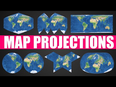
Map Projections Explained - A Beginners Guide
 0:06:16
Why every world map is wrong
 0:01:31
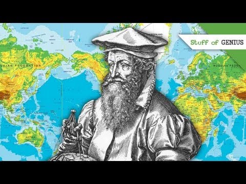
The Man Behind Mercator Projections - Stuff of Genius
 0:12:54
Map Projections Overview and How They Distort the Earth
 0:10:03
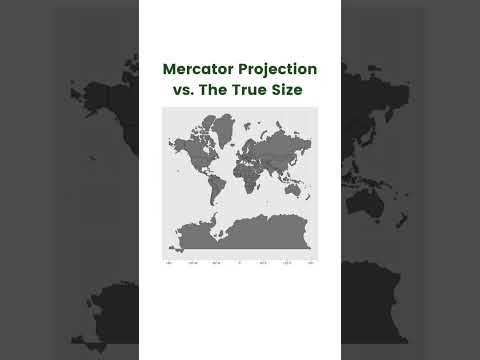
The Real Size Of Countries
 0:00:04
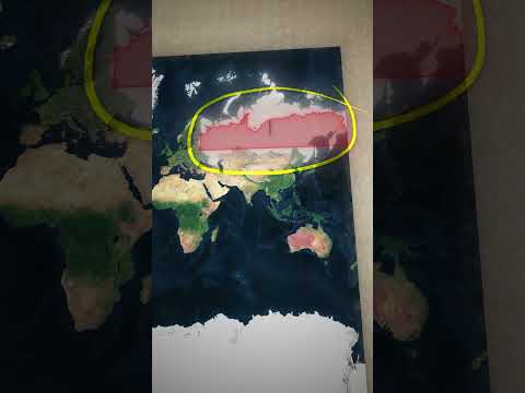
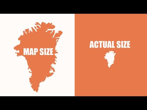
What Countries Look Like In The Mercator Projection vs What The True Size Of These Countries Are
 0:10:48
What Does Earth Look Like?
 0:00:09
mercator projection rotation
 0:05:39
Introduction to UTM, Universal Transverse Mercator
 0:04:33
Can You Make an Accurate Map?
 0:13:21
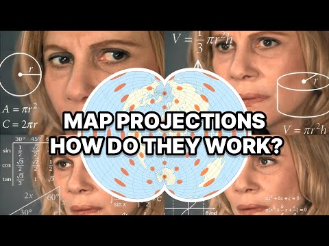
How do Map Projections Work?
 0:12:55
A Strange Map Projection (Euler Spiral) - Numberphile
 0:08:09
Types of Map Projections [AP Human Geography]
 0:10:52
66 Transverse Mercator Part 1
 0:00:54
I've always wondered why Antarctica looked so big on maps 🤯
 0:16:39
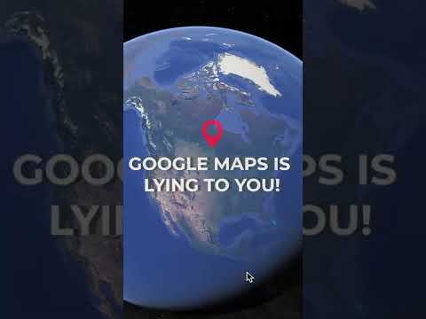
How Maps LIE To You
 0:02:24
Maps That Prove You Don't Really Know Earth
Комментарии