filmov
tv
How the World Map Looks Wildly Different Than You Think
Показать описание
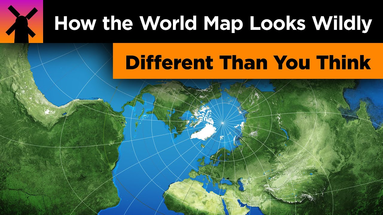
All of us have seen a world map at some point in our lives before, but it is very difficult to imagine how certain countries and parts of the world compare to each other in size that are far apart. In this video, I explore why the world looks very different than how it is portrayed in the Mercator Projection map. I then go on to explore how certain countries are unexpectedly larger or smaller than what they appear to be, and how some places looks wildly different than our perceptions.
PS; Don't totally hate on the Mercator Projection, it's actually a really useful map for navigation and on keeping the correct shape of countries while sacrificing the size that we can all laugh about!
Music is by Ross Bugden. He makes excellent music, please check out his channel!
PS; Don't totally hate on the Mercator Projection, it's actually a really useful map for navigation and on keeping the correct shape of countries while sacrificing the size that we can all laugh about!
Music is by Ross Bugden. He makes excellent music, please check out his channel!
 0:06:20
How the World Map Looks Wildly Different Than You Think
 0:08:02
How the World Map Looks Wildly Different Than You Think REACTION!!
 0:08:26
How World Map Look Different Than You Think? Real Life Lore (Reaction)
 0:05:42
Why All WORLD Maps Are Wrong? How the World Map Looks Wildly Different Than You Think.
 0:05:26
World Map Looks Wildly Different Than You Think REACTION MASHUP
 0:05:57
How the World Map Looks Wildly Different Than You Think
 0:08:57
How The World Map Looks Wildly Different Than You Think REACTION!!!
 0:00:59
How the world map looks wildly different then you think
 0:02:07
Countries Map Look Like Things From Different Countries
 0:07:00
How the World Map Looks Wildly Different Than You Think (REACTION 🔥)
 0:07:09
Russia is TINY?! How the World Map Looks Wildly Different Than You Think [Reaction]
 0:08:09
How the World Map Is Different Than It Looks
 0:02:02
World countries map look like different things
 0:00:39
Countries map that look like Things and Animals #shorts
 0:13:51
British Couple React To - How the World Map Looks Wildly Different Than You Think !!! WOW
 0:00:59
The Real Size of Countries and Continents #shorts #geography #map #education #facts
 0:00:10
How the world map Will Look Like When All Muslims Unite
 0:04:05
The map that shows what the world REALLY looks like
 0:00:18
How does World Map look in Minecraft 🤔 #shorts
 0:10:15
How the World Map Looks Wildly Different Than You Think (RealLifeLore) CG Reaction
 0:10:10
AMERICAN LOOKS AT THE WORLD MAP FOR THE FIRST TIME😲
 0:01:16
Countries Map That look like Things And Animals || Countries Map From Different Countries
 0:03:38
How The World Map Looks Totally Different || T Talks
 0:00:43
County Map Looks Like Things From Different Country
Комментарии