filmov
tv
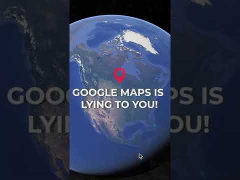
All Maps Lie! The Mercator Projection, The Most Commonly Looked at Map In The World, isn't So Right.

Показать описание
From original on TikTok @map_nerd:
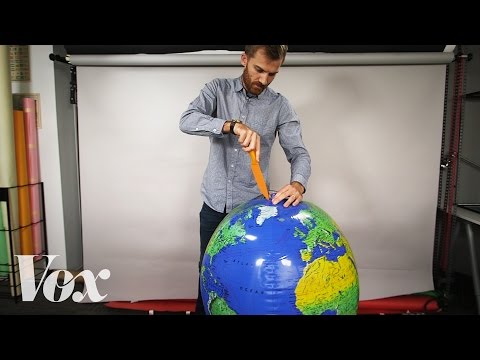
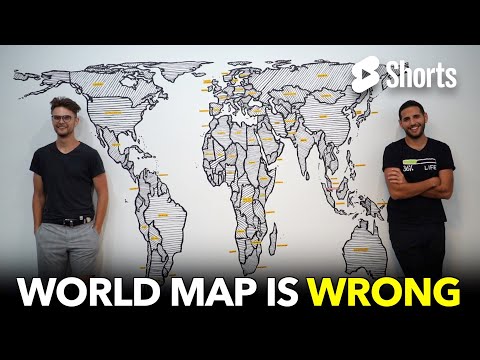
There’s a basic problem in showing the world on a flat map. The world's not flat, so that’s the problem.
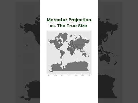
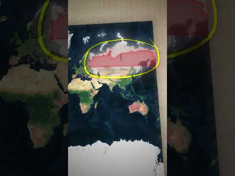
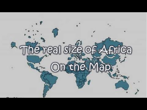
When you take something that’s a round globe and try to flatten it out, things get very distorted; like a lot of places that look tiny are much bigger, and places that look massive are actually tiny.
Australia is actually a similar size to the lower 48 of the US even tho it looks like a much smaller island. Brazil is actually bigger than the contiguous US. (Contiguous= not counting Alaska, Hawaii). The whole of The UK (Britain) fits into Michigan.
And that giant thing on the top of every map that towers over everything - Greenland - its really not that big - it’s more like the size of Mexico.
Maps you look at everyday , like Google Maps and the ones you pull down in school (do they still have those?) don’t actually show the world as it really is. They can’t.
It’s actually physically impossible to flatten a sphere without distorting it somehow. Try it.
The most commonly used map type - called the Mercator Projection - was designed over 450 years ago and it was made that way mainly so boats could navigate without getting totally confused. Now it’s pretty much ingrained in everything we look at. There’s lots of debate if it’s the best way to look at the world for a lot of reasons (including the fact that it seems to favor places like Europe at the expense of places like Africa).
There’s lots of other ways to make a flat map of the world but none will ever be perfect. check them out - it might change how you look at the world.
Комментарии
 0:01:00
 0:01:01
 0:06:00
 0:16:39
 0:00:50
 0:06:20
 0:00:20
 0:00:28
 0:06:16
 0:00:04
 0:04:58
 0:00:58
 0:05:49
 0:03:48
 0:01:00
 0:10:56
 0:07:22
 0:00:54
 0:00:06
 0:01:00
 0:00:59
 0:12:54
 0:00:34
 0:02:17