filmov
tv
R tutorial: Creating Maps and mapping data with ggplot2

Показать описание
This video shows you how you can simply create country maps in R and then colour code countries according to some data, in this case % of the population having received a covid vaccine. I'll show you how you can alter the map properties and even put your own logo on the map.
 0:10:30
R tutorial: Creating Maps and mapping data with ggplot2
 0:21:26
How To Create Interactive Maps with R | Step-By-Step Tutorial
 0:24:42
Rebuild this COMPLEX Data Visualization with R | A ggplot2 Tutorial
 0:26:51
ggplot for plots and graphs. An introduction to data visualization using R programming
 0:03:19
R Tutorial: Introduction to leaflet
 0:14:16
R tutorial: Mapping data on to a google map using ggmap (part 1)
 0:26:06
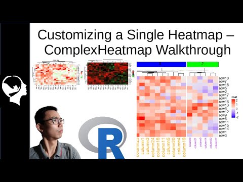
Creating a Heatmap in R | ComplexHeatMap tutorial p1
 0:14:25
Tutorial: Create and Customize a Simple R Shiny Dashboard
 0:07:40
heatmap in R: Tutorial 10-Heatmap, Data Visualization using R , GGplot2, data correlation
 0:47:22
R Lecture | Data Visualization | Map Visualization
 1:44:53
Rayshader Tutorial—Florida Population Density
 0:03:29
R Tutorial: ChIP-seq Workflow
 0:04:26
Self-Organizing Maps (SOMs) in R Tutorial - Visualizing using the kohonen package
 0:04:35
R Tutorial: Access to coordinates from Open Street Map
 0:24:57
Step-by-step heatmap tutorial in R with pheatmap()
 1:26:19
R Shiny for Data Science Tutorial – Build Interactive Data-Driven Web Apps
 0:01:00
How to Bake Normals in 1 minute Blender Tutorial
 0:00:51
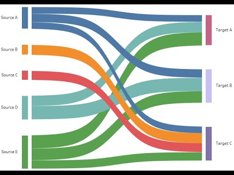
Tableau Mini Tutorial: Creating Sankey Chart in One Minute
 0:03:05
R Tutorial: Getting to know your raster data
 0:02:20
D3.js in 100 Seconds
 0:10:51
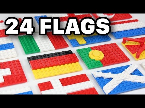
LEGO WORLD FLAGS TUTORIAL - Part 1
 0:16:02
ggplot2 Tutorial | ggplot2 In R Tutorial | Data Visualization In R
 0:12:53
🌍 How to make interactive Excel Map charts
 0:05:29
Interactive Maps | A World Anvil Quick Guide Tutorial
Комментарии