filmov
tv
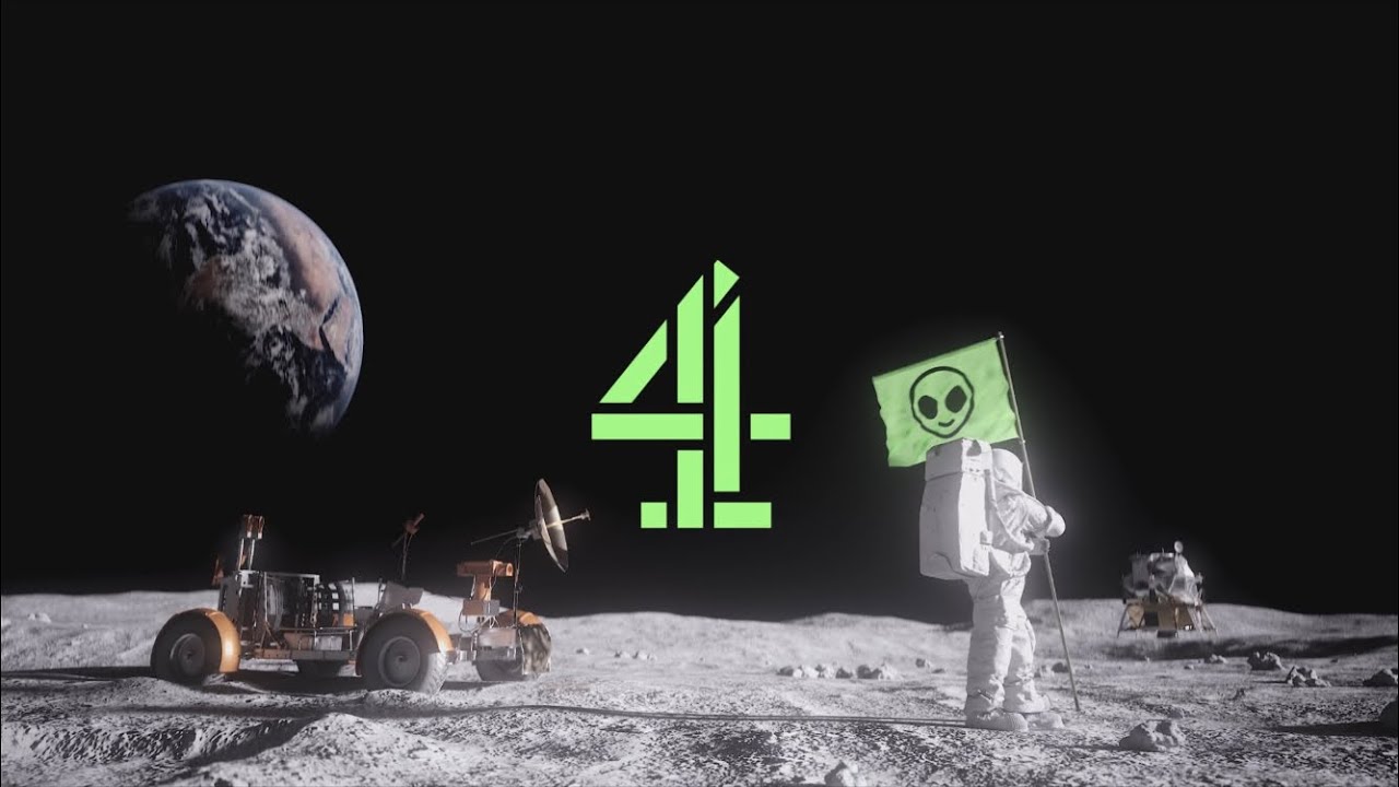
Channel 4 - 2023 Rebrand Montage (4creative)
Показать описание
From 4creative on Vimeo:
What are your opinions on the refresh? Personally, I appreciate the quirkiness of the idents and I get what it’s going for, but it just doesn’t feel like Channel 4. Compared to previous brandings of this channel which have held an impact for many, it’s almost like this is a letdown. Especially the fact that it’s all streaming-centred. However I guess it suits considering the way their programmes are going (Late Night Lycett can fuck off.)
Guess we’ll just have to wait and see…
 0:02:28
Channel 4 - 2023 Rebrand Montage (4creative)
 0:00:19
Channel 4 - New Ident #2 (Streaming) - (2023 Rebrand)
 0:03:28
Channel 4 Idents 2023 – Full Film | Channel 4
 0:00:22
Channel 4 - (REBRAND) New Ident 1 - 14/06/2023
 0:00:22
Channel 4 - (REBRAND) New Ident 3 - 14/06/2023
 0:00:21
Channel 4 - (REBRAND) New Ident 5 - 14/06/2023
 0:00:31
Channel 4 - New Ident #1 - (2023 Rebrand)
 0:00:06
Channel 4 - 2023 Rebrand - Endcard Test
 0:29:25
CHANNEL 4 2023 IDENTS | The Ident Review
 0:00:15
Channel 4 - 2023 Rebrand Menu Template test
 0:03:51
Channel 4 Idents 2023 – 5x Idents Compilation | Channel 4
 0:00:21
Channel 4 (2023) Rebrand - Trending On Ident [FANMADE]
 0:00:19
Channel 4 (SD) - 2023 Rebrand Ident 2 (With Speaking)
 0:00:21
CHANNEL 4 REBRANDED - STREAMING PROMO (May 2023) - ALL 4 Revamp
 0:13:07
Channel 4 - Junctions - 3 May, 2023 (2023 REBRAND)
 0:00:22
Channel 4 - (REBRAND) New Ident 2 - 14/06/2023
 0:00:23
Channel 4 (SD) - 2023 Rebrand Ident 4 (With Speaking)
 0:03:48
Channel 4 - (REBRAND) New Idents Compilation 2023
 0:00:08
Channel 4 (2023 Rebrand) - End Card - Girl from Nowhere [FANMADE]
 0:06:43
Channel 4 Idents 2023 - Behind the Scenes | Channel 4
 0:00:08
Channel 4 (2023 Rebrand) - End Card - Chainsaw Man [FANMADE]
 0:00:21
Channel 4 - 2023 Rebrand - Trending On Ident [FANMADE]
 0:03:01
Channel 4 continuity 14/06/2023 (Last junction before the 2023 rebrand)
 0:00:08
Channel 4 (2023 Rebrand) - End Card - María la del Barrio [FANMADE]
Комментарии