filmov
tv
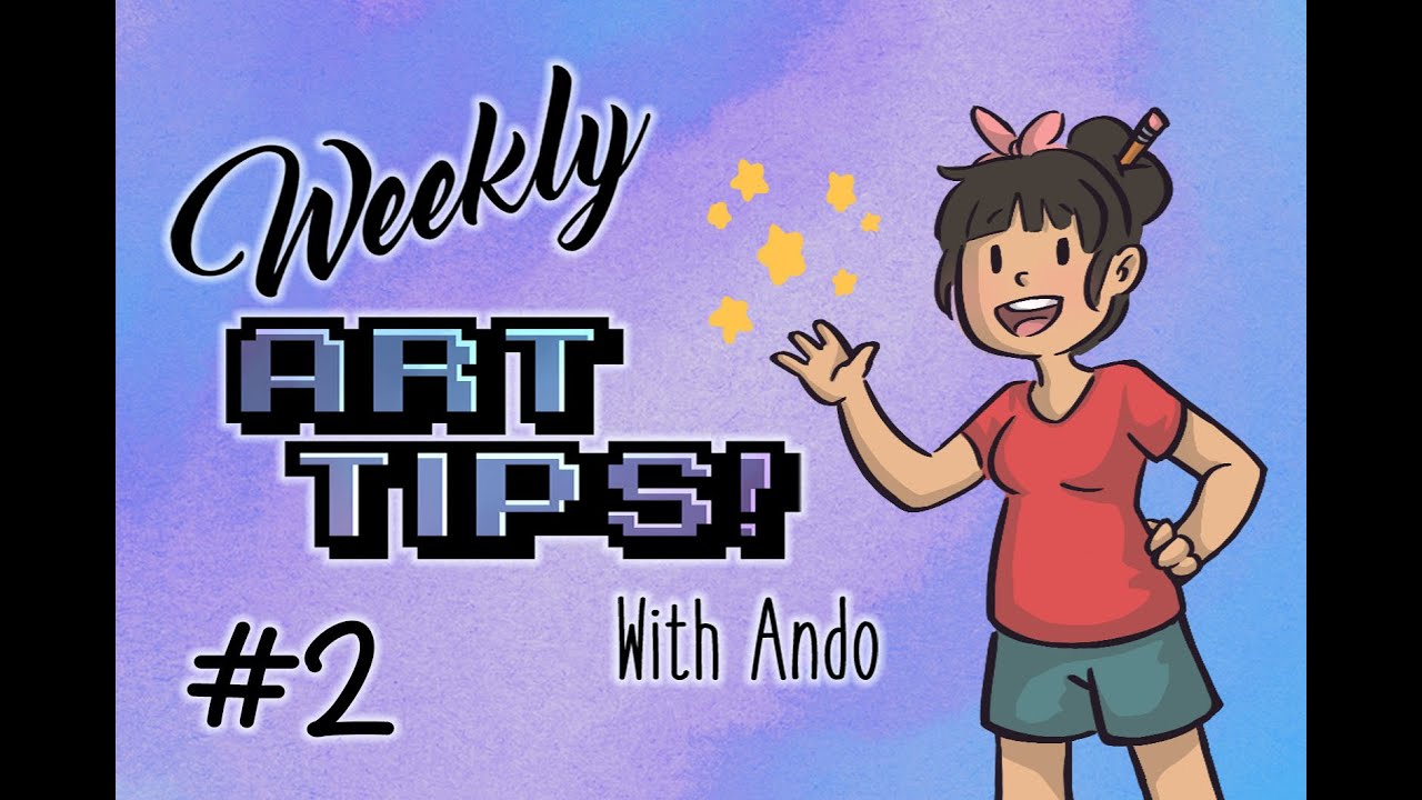
Weekly Art Tips #2- Keep it Simple

Показать описание
Please let me know how you like the episodes so far!
Classical images use (in order):
1893 Reconstruction of “The Alexander Mosaic” (original Roman, c.100BC)
Jean-Antoine Watteau, “The Embarkation for Cythera” (1717)
Salvador Dali, “Old couple or musician" (1930)
Outro music: Little Lily Swing by Tri-Tachyon
This video is used under an Attribution 4.0 license as a derivative work of "Little Lilly Swing" by Tri-Tachyon.
Weekly Art Tips #2- Keep it Simple
Mistake When Drawing Hips - Quick Art Tips #art #sketch #shorts #tutorial #drawingtutorial #anime
Art Tips That INSTANTLY Improved My Art
Mistake When Drawing Poses - Quick Art Tips #art #sketch #shorts #tutorial #drawingtutorial #anime
Mistake Drawing Perspective - Quick Art Tips #art #sketch #shorts #tutorial #drawingtutorial #anime
Mistake When Drawing Torso - Quick Art Tips #art #sketch #shorts #tutorial #drawingtutorial #anime
tips for overcoming art block
NEVER ZOOM IN ON YOUR ART🔎‼️ #drawing #art #arttips #arttutorial #artist #anime
✨ 'Gold Leaf Painting Tips You NEED to Know! 🎨 #GoldLeaf #ArtTips #PaintingIdeas'
Anatomy tips to keep your art from looking 🗑️ #art #drawing #arttutorial #arttips
Mistake When Drawing - Quick Art Tips #art #sketch #shorts #tutorial #drawingtutorial #anime
Mistake When Drawing Cloth - Quick Art Tips #art #sketch #shorts #tutorial #drawingtutorial #anime
4 art tips for sketching✏️🦏 #art #drawing #artist #arttips #arttutorial
2 more art tips so your art is mid🐐 #art #drawing #arttips #arttutorial #artist
Art tips part 1 #shorts #art #tips
Mistake When Drawing Hair - Quick Art Tips #art #sketch #shorts #tutorial #drawingtutorial #anime
The BEST lineart brushes in Clip Studio! #clipstudiopaint #arttips
3 Tips that Improved my Art (drastically) #shorts
Mistake When Drawing Lines - Quick Art Tips #art #sketch #shorts #tutorial #drawingtutorial #anime
Art Tips For Drawing Better ✨️ Hair ✨️
How can we improve this drawing... #art #arttips #arttutorial #drawingtips #drawingtutorial
Why you should gesso your canvas before painting 🌸 #shorts #artvlog #arttips
The BEST art supply tips to get you organized and ready to paint ASAP
How to Draw LEGS | Mastering Anthropomorphic Characters with Fur-tastic Art Tips
Комментарии
 0:06:03
 0:00:31
 0:00:37
 0:00:35
 0:00:33
 0:00:41
 0:00:23
 0:00:25
 0:01:01
 0:00:24
 0:00:34
 0:00:33
 0:00:26
 0:00:26
 0:00:44
 0:00:33
 0:00:15
 0:00:49
 0:00:33
 0:00:47
 0:01:00
 0:00:18
 0:00:24
 0:00:58