filmov
tv
Progress Chart With Pivot Table and Slicer

Показать описание
In this video, I'll show you how to create a dynamic progress chart using a pivot table and slicer. This is a really neat way to level up your dashboards with interactive charts.
In this video I will demonstrate:
How to create a pivot table
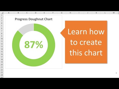
How to create a doughnut chart
How to use a slicer to filter data
Timestamps
0:00 Intro
0:30 Creating a pivot table
4:00 Creating a doughnut chart
18:45 Creating a slicer to filter the data
If you find my videos informative, please give this video thumbs up. And, please consider subscribing and clicking the notification icon to be notified when I release new videos.
#excelhowto #exceltutorials #learnexcel
In this video I will demonstrate:
How to create a pivot table
How to create a doughnut chart
How to use a slicer to filter data
Timestamps
0:00 Intro
0:30 Creating a pivot table
4:00 Creating a doughnut chart
18:45 Creating a slicer to filter the data
If you find my videos informative, please give this video thumbs up. And, please consider subscribing and clicking the notification icon to be notified when I release new videos.
#excelhowto #exceltutorials #learnexcel
 0:26:29
Pivot Table with Progress Chart and Dashboard
 0:20:09
Progress Chart With Pivot Table and Slicer
 0:00:32
Progress Bars in Excel‼️ #excel #exceltips #exceltutorial
 0:00:35
Progress Charts in Excel! 8 Types That Will Help You Get Ahead
 0:00:54
Excel tip for progress chart percent
 0:08:45
HOW TO CREATE A PIVOT TABLE, PROGRESS CHART AND DASHBOARD
 0:24:13
Pivot Table with Progress Chart and Dashboard
 0:10:31
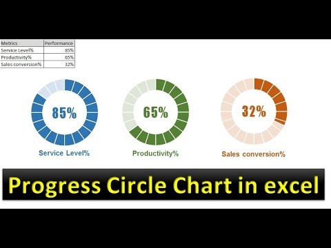
Progress Circle Chart in Excel as NEVER seen before!
 0:26:29
Pivot Table with Progress Chart and Dashboard
 0:00:31
Progress Tracker in Excel‼️ #excel
 0:40:04
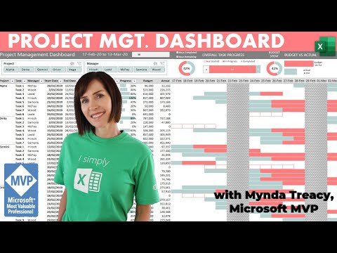
Interactive Excel Project Management Dashboard - FREE Download
 0:00:54
MAKE a Progress Bar Chart in Excel LIKE a PRO in 2024!
 0:12:29
Infographics: Progress Circle Chart in Excel
 0:07:11
Progress Circle Chart in Excel - Part 1 of 2
 0:07:16
How To Create A Gantt Chart With A Progress Bar To Show Percentage Completion Of Tasks In Excel
 0:19:41
How To Create A Dynamic Excel Dashboard With Pivot Charts | FREE Download
 0:00:56
Excel | progress chart | dounut graph with check box #pivot #exceltutorial #design #exceltutorial
 0:06:00
How to make a Pivot Table , Progress Chart & Dashboard using Excel | STID1103(I) A202
 0:05:04
Pivot Table with Progress Chart and Dashboard(Vẽ biểu đồ tiến độ) | Excel Chart Tips
 0:00:23
How to create an s-curve combo chart in #excel #exceltips #exceltricks
 0:34:26
Excel Gantt Chart with Pivot Table (V006)
 0:10:48
Progress Circle Chart Infographics in Excel Dashboard
 0:05:33
Easy Excel S-Curve Charts for Tracking Progress Over Time
 0:00:55
Create progress bar in excel with percentage - Excel Tips and Tricks
Комментарии