filmov
tv
Progress Circle Chart in Excel - Part 1 of 2
Показать описание
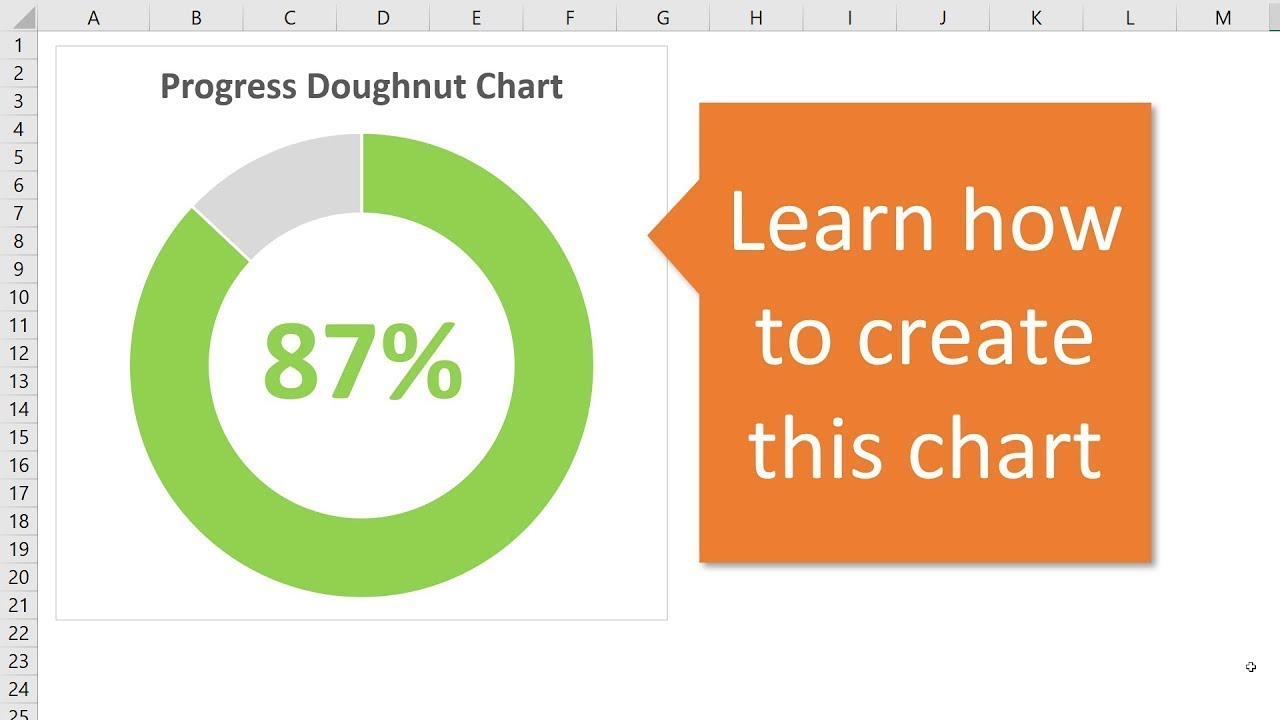
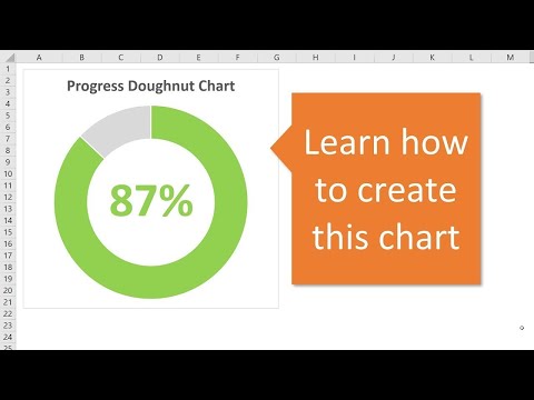
The progress circle (doughnut) chart displays the percentage of completion on a single metric. This is a simple chart that can be used in dashboards to show the progress towards a goal or target. It's basically a progress bar chart in the shape of a circle or doughnut.
In this first video, we look at how to create the progress doughnut chart in Excel. It is a simple chart that just requires 1 doughnut chart and a formula.
In part 2 of the video series, I explain how to apply conditional formatting to the chart so the color of the bar changes as the progress level changes.
 0:10:31
Progress Circle Chart in Excel as NEVER seen before!
 0:12:29
Infographics: Progress Circle Chart in Excel
 0:07:11
Progress Circle Chart in Excel - Part 1 of 2
 0:13:18
How to Create Dynamic Progress Circle Charts in Excel
 0:10:48
Progress Circle Chart Infographics in Excel Dashboard
 0:12:34
How to Create a Progress Circle Chart in Excel - Dynamically Display Percentage of Completion
 0:06:08
How to create a Progress Circle Chart in Excel (Donut Chart) - Full Tutorial
 0:13:51
Infographics: Progress Circle Chart in Excel
 0:00:58
Quick Excel Mastery: Progress Circle Charts in Just 60 Seconds!
 0:22:04
Progress Circle charts in Excel as never seen before
 0:00:57
Quick trick: Half Progress Circle Chart in Excel #excelcharts
 0:06:26
How to WOW Your Boss: 3D Progress Circle in Excel 🚀
 0:00:54
Excel tip for progress chart percent
 0:03:21
How to Make Progress Chart in Excel | Progress Circle Chart in Excel
 0:02:47
Create a dynamic progress circle chart like a pro #excel #exceltips #shorts
 0:01:23
Quick Excel Mastery: Progress Circle Charts in Seconds!
 0:04:29
How to Create a Dynamic Progress Circle Chart in Excel
 0:06:42
Excel: Create Progress Circle Chart with Thick & Thin Lines
 0:09:26
Create a Progress Circle Chart in Excel
 0:14:15
Progress Circle chart in Excel 2010
 0:01:44
How to Create a Sliced Donut Chart in Excel | Easy Step-by-Step Guide
 0:00:18
How to add data labels on Pie Charts in Excel (video out now!)
 0:04:36
Progress Circle Chart In Excel | How To Create Circular Progress Chart In Excel | Simplilearn
 0:10:08
How to Create a Progress Circle Chart with Increments in Excel
Комментарии