filmov
tv
How do you conditionally highlight a bar in a Power BI Report?

Показать описание
There are different interactions Power BI visuals can have, but how do we conditionally highlight a bar in a Power BI report using a slicer? Patrick shows you some MAGIC to get this to work.
*******************
Want to take your Power BI skills to the next level? We have training courses available to help you with your journey.
*******************
LET'S CONNECT!
*******************
***Gear***
#PowerBI #ConditionalFormatting #GuyInACube
*******************
Want to take your Power BI skills to the next level? We have training courses available to help you with your journey.
*******************
LET'S CONNECT!
*******************
***Gear***
#PowerBI #ConditionalFormatting #GuyInACube
 0:07:07
How do you conditionally highlight a bar in a Power BI Report?
 0:09:40
Excel Conditional Formatting with Formula | Highlight Rows based on a cell value
 0:01:30
Excel Conditional Formatting based on Another Cell | Highlight Cells
 0:03:55
Highlight entire row in Excel with conditional formatting
 0:03:03
How to Auto Highlight Row Based on Cell Value in Excel
 0:07:02
Highlight Cells Based on Criteria in Excel | Conditional Formatting in Excel
 0:06:43
Conditional Formatting in Excel Tutorial
 0:02:32
Make Reports Easier to Read with Conditional Highlighting
 0:08:03
Conditional Formatting: Highlight Rows Based On Another Cell's Value
 0:00:27
How to: Use Conditional Formatting Rules in Sheets
 0:03:37
Conditional Formatting (Highlight a Cell) in Tableau
 0:04:15
Use Conditional Format to Highlight Overdue Dates
 0:01:53
Select / Highlight / Conditionally Format Blank Cells In Excel | Automatically Highlight Blanks
 0:01:51
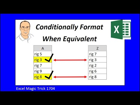
Conditionally Format When Two Columns have Same Value. Excel Magic Trick 1704.
 0:02:28
Highlight Text Values with Conditional Formatting - Excel
 0:08:39
Highlight Max & Min Values in an Excel Line Chart (Conditional Formatting in Charts)
 0:04:25
Conditional Formatting Formulas - Mystery Solved with 3 Simple Rules
 0:09:29
Excel How To: Format Cells Based on Another Cell Value with Conditional Formatting
 0:05:07
How to Highlight an Entire Row in Tableau
 0:12:00
5 Conditional Formatting tips to make you a rock star at work 🤘
 0:03:02
Highlight Dates that are Past the Due Date in Excel (or about to be due)
 0:01:26
How to Conditionally Format Cell Background Color in Tableau
 0:06:06
How to Highlight a Single Column in Tableau
 0:03:43
Highlight Weekdays and Weekends Using Conditional Formatting in Excel
Комментарии