filmov
tv
Creating a labeled scatter plot in R with ggplot2 (CC157)

Показать описание
A labeled scatter plot is an effective approach when you want to highlight something about data that you are measuring with two continuous variables. In this episode of Code Club, Pat shows how he would convert a slope chart into a labelled scatter plot to display the change in people's intention to receive the COVID-19 vaccine with data from 2020. He uses geom_point from ggplot2 to create the scatter plot and then shows how to add labels using geom_label or geom_label_repel (from ggrepel). Finally, he also uses geom_abline, coord_fixed, and geom_text to create a legend. The data depict the percentage of people in 15 countries who would be willing to receive the COVID-19 vaccine as of August and October of 2020.
You can also find complete tutorials for learning R with the tidyverse using...
0:00 Creating a labeled scatter plot
2:31 Creating scatter plot
4:50 Giving context to the data with coord_fixed and abline
6:37 Cleaning up theme settings
7:51 Adding a diagonal line with a legend
11:22 Adding labels to the points
15:51 Critique of figure
 0:04:42
How to Make a Scatter Plot in Excel
 0:06:03
Statistics - Making a scatter plot
 0:00:21
How To Create A Scatter Plot In Excel
 0:03:13
How to create a scatter plot and customize data labels in Excel
 0:04:39
Creating a Scatter Plot in Excel 2016
 0:00:27
Axes options in Excel
 0:06:59
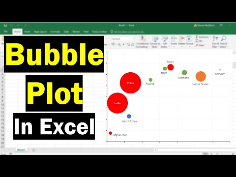
How To Create A Bubble Plot In Excel (With Labels!)
 0:07:12
Adding Data Labels to a Scatter Graph - Made Easy
 2:28:01
Lecture-8: Data Visualization with Matplotlib & Seaborn | Python | Data Analytics | AI | ML| Ser...
 0:17:14
Creating a labeled scatter plot in R with ggplot2 (CC157)
 0:05:26
How to Create a Four Quadrant Chart in Excel | Quadrant Scatter Plot | Quadrant Matrix Chart
 0:16:30
How To Create A Scatter Plot In GraphPad Prism
 0:02:31
Excel scatter plot with group colouring
 0:02:00
How to make a multiple scatter plot
 0:06:07
Creating an XY Scatter Plot in Excel
 0:04:51
Scatter Plots, Association and Correlation
 0:04:09
Data & Text Labels on Scatter Plot
 0:02:31
Constructing a scatter plot | Regression | Probability and Statistics | Khan Academy
 0:04:36
Using Scatter Plot Trend Lines to Make Predictions
 0:03:53
How to Create and Label a Scatter Plot in Excel 2007
 0:01:57
How To Construct A Scatter Plot Graph - What Is A Scatter Plot Graph
 0:05:19
Creating a Scatter Plot in Excel and Embed it Into a Word Document 2016
 0:05:48
How to Create Multi-Color Scatter Plot Chart in Excel
 0:06:49
Scatter Plot in Power BI | When to use the Scatter Plot | Animated Scatter Plot in Power BI | #16
Комментарии