filmov
tv
Creating the NASA GISS animated climate spiral in R (CC220)

Показать описание
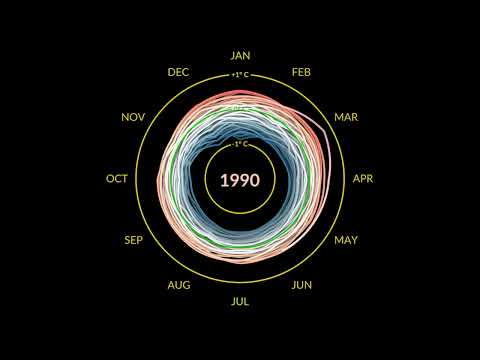
In this episode Pat will use R to adapt a figure made by one creator to look like one made by another creator. He'll share his thought process for thinking about what code needs to be adapted to achieve the desired effect. This will all be done using animated climate spirals of monthly temperature anomalies by month using NASA's GISS data using tools from the ggplot2 and gganimate R packges. This figure shows the deviation in annual global mean temperatures from the normalized temperatures of 1951 to 1980 as a line plot. The lines are colored according to the size of the temperature anomaly. He uses transition_reveal, transition_manual, coord_polar, geom_line, scale_color_viridis_c, and a smattering of arguments from the theme function to create this provocative visual. All of this is done in R with the help of RStudio.
#ggplot2 #gganimate #Rstudio #climatechange #R #Rstats
You can also find complete tutorials for learning R with the tidyverse using...
0:00 Introduction
6:02 Change apperance of background
7:47 Remove title
8:40 Reformat month labels
12:25 Change color to be by temperature rather than year
15:36 Modifying appearace of gridlines
20:08 Adjusting the limits along the radius
21:19 Adjusting the gaps in the gridlines
24:32 Animating visualization
 0:25:42
Creating the NASA GISS animated climate spiral in R (CC220)
 0:20:28
Plotting the global temperature index as bars using ggplot2 and NASA GISS data (CC215)
 0:00:30
New NASA Animation: It's Getting Hot in Here - Especially Up North
 0:10:42
NASA GISS Climate Data Mining
 0:01:10
Climate Spiral
 0:02:01
Chalk Warfare
 0:00:31
NASA Climate Spiral
 0:00:31
NASA Climate Spiral 1880-2022
 0:00:31
NASA Climate Spiral 1880-2022
 0:01:12
Climate Spiral (NASA)
 0:01:11
NASA’s new climate change GIF made the internet go crazy
 0:00:31
Global Warming from 1880 to 2021
 0:00:26
Global Temperature Anomalies (1881-2009) [720p]
 0:21:27
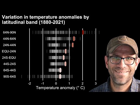
A rug chart in R with ggplot2's geom_segment showing latitudinal temperature anomalies (CC228)
 0:01:11
A demonstration of the progression of global warming - GISTEMP Spiral 2022-03-06 NASA Climate Change
 0:02:23
NASA Climate Spiral
 0:00:31
Shifting Distribution of Land Temperature Anomalies, 1962-2022
 0:00:17
Climate Change 3D Spiral
 0:00:30
Global Warming from 1880 to 2022
 0:24:47
Recreating animated climate temperature spirals in R with ggplot2 and gganimate (CC219)
 0:01:11
GISTEMP Climate Spiral of DOOM (4K)
 0:00:30
Last 70 years of Earth's land temperatures - Climate Change from NASA data
 0:00:40
Animation of temperature changes by country between 1880 and 2021
 0:01:31
NASA's Earth Minute: Usual Suspects
Комментарии