filmov
tv
Climate Spiral

Показать описание
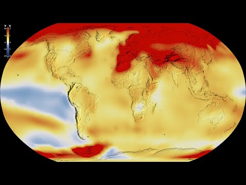
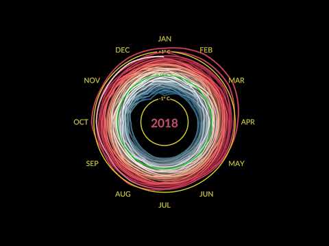
This visualization shows monthly global temperature anomalies (changes from an average) between the years 1880 and 2021. Whites and blues indicate cooler temperatures, while oranges and reds show warmer temperatures. As you can see, global temperatures have warmed from mainly human activities as time has progressed.
 0:01:10
Climate Spiral
 0:01:01
Climate Spiral: 1880-2022 (Degrees Celsius)
 0:00:30
July 2023 Record High Global Temperatures
 0:01:01
Climate Spiral (1880-2022)
 0:01:04
3D Climate Spiral with Three.js
 0:01:10
GISTEMP climate spiral - monthly global temperature anomalies between the years 1880-2021
 0:01:01
Climate Spiral: 1880-2022 (Degrees Fahrenheit)
 0:01:05
monthly climate spiral - check the unleashing over the last 10 seconds up to March 2024
 0:00:30
Global Warming from 1880 to 2022
 0:01:11
Nasa's climate spiral
 0:01:05
monthly climate spiral - check the unleashing over the last 10 seconds up to December 2023
 0:01:05
monthly climate spiral - check the unleashing over the last 10 seconds up to November 2023
 0:01:24
NASA Climate Spiral (Re-created)
 0:01:01
Global climate spiral
 0:41:07
Coding Challenge 178: Climate Spiral
 0:01:03
monthly climate spiral - check the unleashing over the last 10 seconds up to January 2024
 0:01:10
GISTEMP Spiral Climate - NASA
 0:00:30
Summer 2023 Record High Global Temperatures
 0:01:05
monthly climate spiral - check the unleashing over the last 10 seconds up to August 2024
 0:01:11
Climate Spiral This visualization shows monthly global temperature anomalies changes from an average
 0:01:12
Climate Spiral (NASA)
 0:00:31
'Climate Spiral' -- a unique visualization of Climate Change
 0:01:05
monthly climate spiral - check the unleashing over the last 10 seconds up to April 2024
 0:01:05
monthly climate spiral - check the unleashing over the last 10 seconds up to July 2024
Комментарии