filmov
tv
12 Hidden Meanings Behind Famous Logos!

Показать описание
Creating a good logo is more than just making something look pretty.
You need to make it memorable, unique, get the colour scheme right, and if youre really good incorporate a little history or meaning.
To do all that in a small space without making it look like an eye sore, is actually quite a hard creative task.
So in this list ill be showing you 12 hidden meanings behind famous logos.
-------------------------------------------------------
-------------------------------------------------------
12) Amazon
Amazons logo is one of the most famous in the world.
It actually has two clever meanings behind it.
The arrow below it looks like a smile which is always good for business, but look closely and you'll see the arrow goes from the letter A to Z.
In other words Amazon is letting you know that they stock everything from A to Z.
11) Fedex
One of the largest logistic companies in the world with a very clever logo.
While at first glance you don't notice anything odd with it, look closely at the negative space between the E and X.
You'll see an arrow pointing right, in other words FedEx is all about speed & precision and an arrow going forwards is a perfect symbol.
10) Sony Vaio
The Sony Vaio logo is all about being geeky.
After all they do develop laptops so within their logo they incorporated an analog wave & digital signal.
The V and A is made to look like an analog wave.
Whereas the I and O looks like binary from the digital world.
9) Sun Microsystems
Sun microsystems is a company that sells computers, components and software.
It's logo is actually pretty awesome, the square shape to the left is actually made from the word Sun.
No matter what orientation you look at the shape, you can see the word sun written.
8) Hershey Kisses
The famous chocolate probably more famous for its unique shape.
When you look at their logo you wont notice it at first but the shape of the chocolate is actually incorporated within the letters.
If you look at the negative space within the K and I you'll see the shape of a Hershey kiss.
7) Northwest Airlines
Northwest Airlines logo actually has 2 interesting little gems.
Firstly you can see the letters N & W within one letter.
But you'll notice there's a circle around the logo.
If you look at the circle as a compass, the little triangle that would be part of the W, actually points to North West.
6) Toblerone
To understand Toblerone's logo you need to know that the company comes from Bern Switzerland.
Bern is known as the City of Bears, and its also home to the Matterhorn Mountain.
That explains the mountain in the Toblerone logo but if you look closely there's a bear hidden in there too.
Within the negative space there's a large bear standing up.
5) Eighty20
Eighty20 is a financial management company that handles a lot of data.
Within their logo they have showed us just how geeky the company is.
While at first glance is just looks like random squares, those squares represent binary code.
The darker squares represent 1's and the lighter squares represent 0s.
So the top line in binary reads 80, and the bottom line, you guessed it reads 20.
4) Picasa
The image sharing sites logo is obviously a camera shutter.
That's pretty standard but look closely and you'll also see a house within the camera shutter.
That's because "casa" in Spanish translates to "house".
So essentially youre seeing a logo for a company called Picture house.
3) Beats
Beats creates high end headphones.
If you look at their logo you may have noticed that its actually someone wearing one of their headphones.
A very simple design that's very clever and effective.
2) Adidas
The famous three stripes of the Adidas logo do have meaning behind it.
They are meant to form a mountain or hill.
Which represents the obstacles that athletes need to overcome.
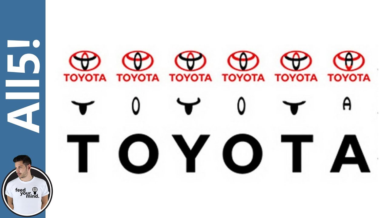
1) Toyota
Toyota's logo officially is meant to represent the unification of the hearts of their customers and the heart of Toyota products.
However if you break down the logo into parts something pretty amazing occurs.
You can spell out the word Toyota just from its logo.
Whether it was a complete accident or not, this is some pretty amazing logo design.
Комментарии
 0:04:41
 0:09:00
 0:06:33
 0:14:56
 0:10:28
 0:10:53
 0:09:01
 0:00:28
 0:08:30
 0:07:16
 0:00:33
 0:09:26
 0:00:46
 0:06:06
 0:08:28
 0:26:12
 0:05:52
 0:12:14
 0:00:43
 0:01:38
 0:08:32
 0:00:48
 0:09:41
 0:03:41