filmov
tv
12 Hidden Symbols In Famous Logos You Had No Idea About
Показать описание
Take a look at all the famous logos with the hidden messages that might surprise you. Every line and color in the logos of the world’s most famous companies have a whole lot of meaning behind them. From hidden messages in Wendy’s symbol to NBC’s peacock secret – get ready to learn a bunch!
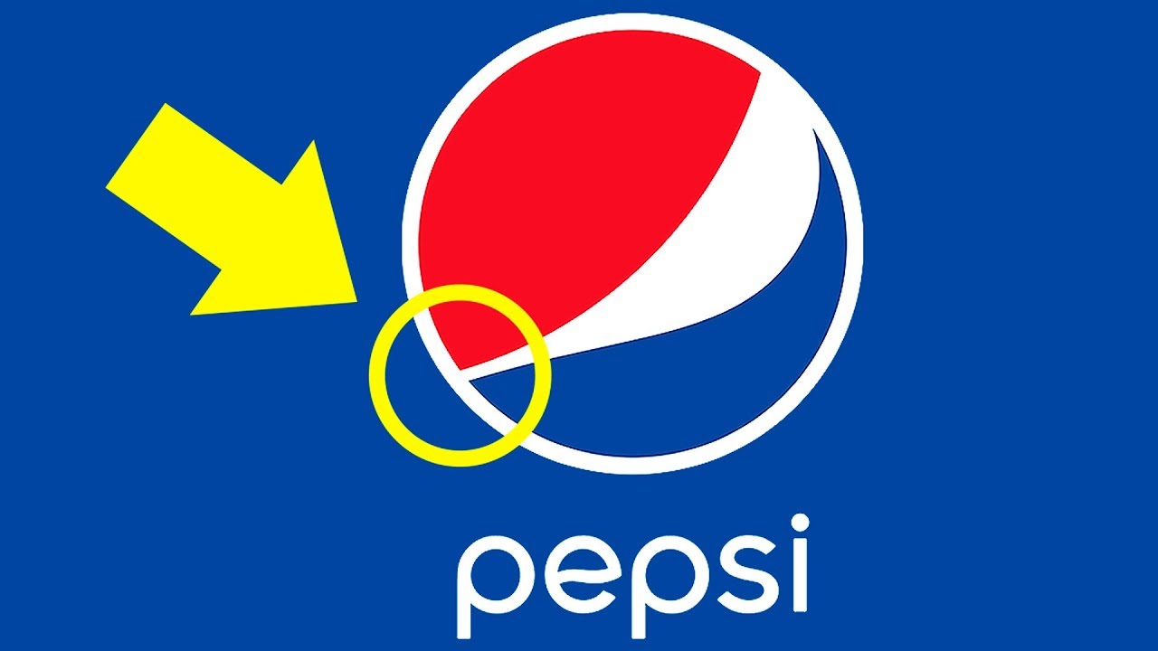
For example, it’s hard to believe, but Pepsi paid over a million dollars to create this special logo with its secret meanings. The new design hints at mysterious and secretive themes, such as the Earth’s magnetic field, Feng shui, Pythagoras, geodynamics, the theory of relativity, and the golden ratio. The designer has explained that this logo also makes reference to Mona Lisa, the Parthenon, and even René Descartes. The red, white and blue colors have always represented the American flag.
TIMESTAMPS
Paramount Pictures 0:28
Domino's Pizza 1:22
Hershey’s Kisses 2:19
NBC 3:09
Carrefour 3:56
Roxy 4:24
Cisco 4:56
Picasa 5:19
Nintendo Gamecube 5:54
Unilever 6:22
Wendy's 7:14
Pepsi 7:54
SUMMARY
- Paramount Pictures
They say the first original logo was drawn on a napkin. The mountain on it resembled Ben Lomond in Utah, as it played an important part in the life of studio creator. The 24 stars around the mountain weren’t a random decoration of the logo. They stood for 24 actors and actresses who were the first to sign contracts with Paramount.
- Domino's Pizza
The first original logo had dominos on it. The one dot stood for the very first restaurant. The two dots symbolized the two franchises that opened a few years later. The plan was to add dots for each new restaurant.
- Hershey’s Kisses
Can you see the chocolate Kiss between “K” and “I”? By the way, do you know why Hershey’s Kisses are called so? The most popular version says it’s named after the sound the chocolate makes moving onto the conveyer belt.
- NBC
The peacock was first used as NBC logo back in 1956. Why did they choose a peacock of all birds? For its variety of colors and also to show how proud they were of their new broadcasting technologies.
- Carrefour
Its name translates as “crossroads”. That explains the red and blue arrows that point in opposing directions. The white negative space is also used in a smart way. If you give it a close look, you will see a “C” for “Carrefour” in between the arrows.
- Roxy
Roxy’s logo is more than just a heart to symbolize love for sports. It’s a crest built of two Quicksilver logos on their ends.
- Cisco
Internet networking giant Cisco got its name after the city of its headquarters – San Francisco. Their logo has both a reference to their location and to what they are doing.
- Picasa
Do you know what “casa” means in Spanish? It translates as “home”. The negative space in the center of the logo looks like a little house.
- Nintendo Gamecube
The cube isn’t just a cube within a cube. The outer figure is a letter “G” and the inside negative space forms a clear “C”. GC for Gamecube.
- Unilever
The letter “U” which clearly stands for Unilever is made up of 25 icons which stand for everything that’s important to them. You can find a lock of hair, a tea leaf, a jar, a hand and even a spoon in there, as well as many more symbolic drawings.
- Wendy's
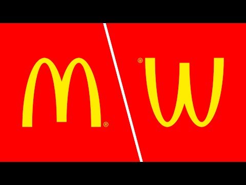
The logo clearly says... “mom”. The idea is that Wendy’s is happy to give you the taste of your mom’s cooking and they want this thinking to stick to you.
- Pepsi
The designer has explained that this logo also makes reference to Mona Lisa, the Parthenon, and even René Descartes. The red, white and blue colors have always represented the American flag.
Which of the logo stories is your favorite? Do you know any more cool logo facts? Tell us in the comments below.
----------------------------------------------------------------------------------------
Our Social Media:
----------------------------------------------------------------------------------------
For more videos and articles visit:
Комментарии
 0:09:00
 0:09:01
 0:10:53
 0:04:41
 0:26:12
 0:06:33
 0:14:56
 0:00:49
 0:23:11
 0:08:32
 0:06:40
 0:00:33
 0:00:43
 0:00:46
 0:09:26
 0:10:28
 0:05:52
 0:08:28
 0:00:29
 0:06:34
 0:00:21
 0:00:28
 0:05:48
 0:04:33