filmov
tv
Data Analysis in Excel | Pivot tables, Charts & EDAs

Показать описание
Lesson 3: Mastering Data Organization with Pivot Tables, Charts, and EDA
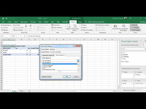
In this lesson, we’ll focus on one of the core skills for data analysis: **transforming raw data into actionable insights**. You’ll learn how to normalize data for better structure and denormalize it for enhanced analysis flexibility. Next, we’ll explore the power of Pivot Tables to summarize, group, and analyze your data with ease. Building on this, we’ll use **Pivot Charts** to visualize these summaries dynamically, uncovering patterns and trends at a glance. Finally, we’ll integrate these techniques with **Exploratory Data Analysis (EDA)** to make sense of complex datasets and unlock deeper insights.
By the end of this lesson, you’ll be equipped to:
- Organize and clean data effectively for analysis.
- Create and customize Pivot Tables for dynamic reporting.
- Design interactive Pivot Charts to visualize your findings.
- Conduct EDA to gain a comprehensive understanding of any dataset.
This is the perfect step to elevate your data analysis game and build a strong foundation for advanced Excel magic!
 10:59:43
 0:13:40
 0:11:51
 1:53:40
 0:13:53
 0:08:16
 7:11:45
 0:24:05
 0:19:16
 0:07:16
 0:00:55
 0:49:16
 0:01:25
 0:08:13
 0:24:40
 0:40:50
 0:16:17
 0:01:43
 1:23:19
 4:11:47
 0:21:02
 1:32:40
 0:00:40
 3:56:43