filmov
tv
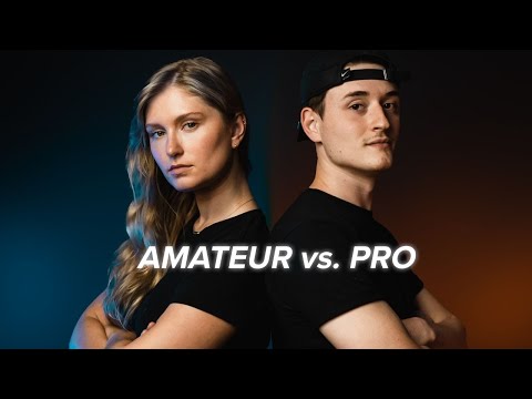
Amateur vs Pro: Advanced UI Design Examples (Before & After)

Показать описание
Onboarding and Sign-up screens are one of the most popular examples of UI Design that most UI and UX designers use to showcase their skills. That is especially true for novice designers, because it is relatively fast and doesn't require a lot of work.
But, it's really hard to stand out with those designs because onboarding and sign-up screens are the most overused way to showcase UI and UX design skills. Especially at services like Dribbble where you can see them everywhere.
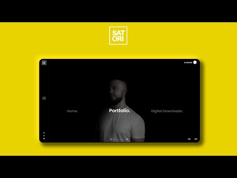
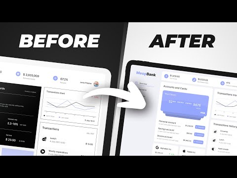
Today I've selected for you 4 examples of mobile app design screens from that category, prepared by novice and more experienced UI and UX designers with the intention of improving them.
Chapters:
00:00 Amateur vs Pro UI Design Examples
00:40 1st Example
02:43 2nd Example
03:25 3rd Example
04:03 Final example
05:00 Outro
#uidesign #uxdesign #uxtutorial #designtutorial #graphicdesign #mobiledesign #productdesign #ui #ux
But, it's really hard to stand out with those designs because onboarding and sign-up screens are the most overused way to showcase UI and UX design skills. Especially at services like Dribbble where you can see them everywhere.
Today I've selected for you 4 examples of mobile app design screens from that category, prepared by novice and more experienced UI and UX designers with the intention of improving them.
Chapters:
00:00 Amateur vs Pro UI Design Examples
00:40 1st Example
02:43 2nd Example
03:25 3rd Example
04:03 Final example
05:00 Outro
#uidesign #uxdesign #uxtutorial #designtutorial #graphicdesign #mobiledesign #productdesign #ui #ux
 0:05:27
Amateur vs Pro: Advanced UI Design Examples (Before & After)
 0:20:46
Amateur vs Pro UI Design | with examples
 0:08:43
AMATEUR VS PRO: Advanced Design Examples (Before & After)
 0:11:05
5 levels of UI skill. Only 4+ gets you hired.
 0:01:01
Reacting to bad UI design part 1
 0:06:23
🔸 Master ADVANCED Hierarchy In Under 7 Minutes! (Important)
 0:08:53
AMATEUR vs. PRO GRAPHIC DESIGNER
 0:05:21
PRO Vs AMATEUR Design Portfolios (With Examples)
 0:06:36
AVERAGE TO AWESOME IN SECONDS! 5 Tips For Professional Design Artwork
 0:11:11
6 UI Hacks I Wish I Knew As A Beginner
 0:01:00
Reacting to bad UI design part 3
 0:01:00
The worst UI designs part 8
 0:00:54
The 3 biggest issues in UI
 0:00:57
Worst website UI ever?!
 0:06:16
PRO Vs AMATEUR Graphic Design (Master This)
 0:09:16
4 Foundational UI Design Principles | C.R.A.P.
 0:10:34
AMATEUR VS PRO: Freepik Designs Improved!! (Before & After Examples)
 0:05:17
PRO Vs AMATEUR – Logo Design Colour Choice (Need To Know)
 0:04:47
Before & After 3 - Advanced UI Design In Action
 0:04:47
Amateur vs Pro: Mobile UI Design (Before & After 10)
 0:06:18
60-30-10 Color Rule
 0:23:56
6 Advanced UI Design Tips (Deep-dive)
 0:00:57
Before & After UX & UI Design
 0:00:18
4 Awful UI Design Mistakes
Комментарии