filmov
tv
I Overcomplicated Famous Brands

Показать описание
The Process
---------------------
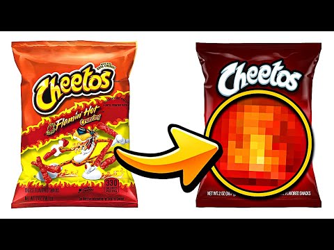
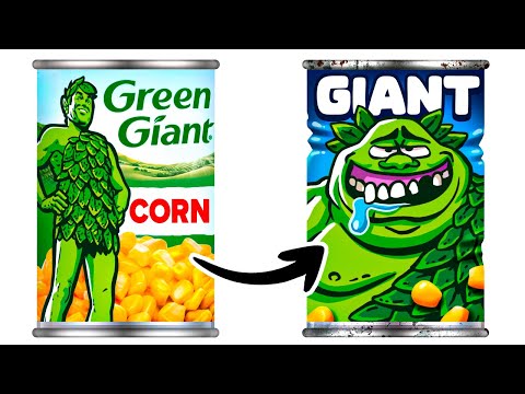
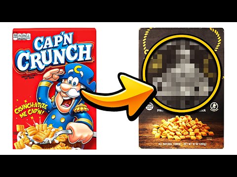
In this video I use Adobe Photoshop CC to redesign 3 popular Package Designs from famous brands and make them more complex. I used a variety of skills including: Logo Design, Illustration, Photobashing, and Painting to create unique designs.
I had a ton of fun making this one!
Find Me Here
---------------------
Instagram: @thebrandonshepherd
Twitter: @bransshep
(Some of the links above are affiliate links, meaning at no additional cost to you, I will earn a commission if you click through and make a purchase.)
I Overcomplicated Famous Brands
I Overcomplicated Popular App Logos
I Oversimplified Popular Packaging Designs
I Overcomplicated Famous Logos...
I Oversimplified Famous Packaging Designs
I Overcomplicated Famous Logos...
I Turned Popular Junk Food “Healthy”
I Made Popular Healthy Brands 'Unhealthy'
I Made Famous Logos ULTRA Realistic
I Made Fictional Products Real
I Made Knockoffs of Popular Products
I Combined Famous Logos to Make Masterpieces
Combining Famous Brands' Logos With Their Competitors' Logo
I Made Cheap Brands Look Expensive
I Made Famous Logos 3D
I Tried the Internet's Most VIRAL Design Challenges
I Overcomplicated Popular App Icons
I Rebranded Cap'n Crunch to be Healthy
I Designed Simple vs Complicated Apps
Combining MORE Famous Competing Brands Logos
I OVERCOMPLICATED popular logos...
Current Logos or Redesign Concepts?
Overcomplicated Famous Brands (Brandon Shepherd )
I Forced Ai to Redesign FAMOUS Logos & I Made It Better
Комментарии
 0:11:19
 0:10:51
 0:11:41
 0:08:31
 0:09:28
 0:08:37
 0:10:09
 0:12:52
 0:12:03
 0:11:48
 0:11:15
 0:12:20
 0:09:38
 0:12:38
 0:10:30
 0:18:54
 0:11:50
 0:07:11
 0:20:29
 0:12:09
 0:02:44
 0:00:52
 0:00:11
 0:11:42