Introduction to Statistics

preview_player
Показать описание
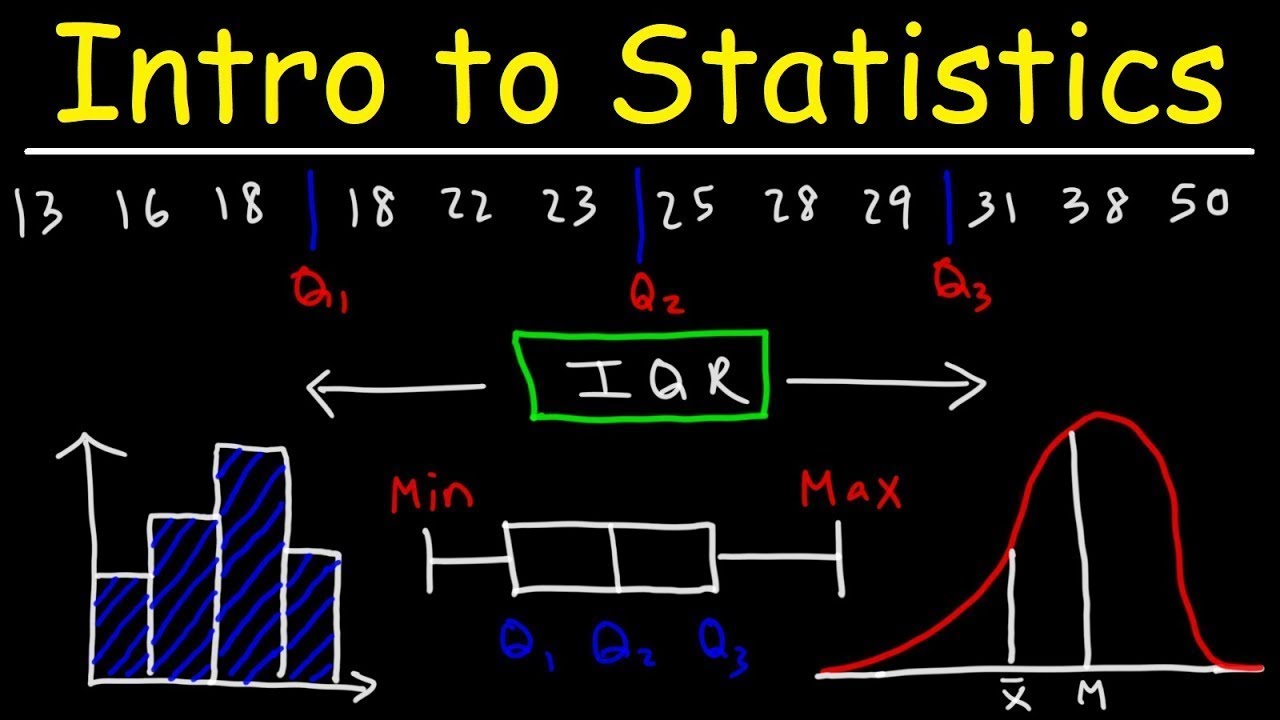
This video tutorial provides a basic introduction into statistics. It explains how to find the mean, median, mode, and range of a data set. It also explains how to find the interquartile range, quartiles, percentiles as well as any outliers. It also mentions how to construct box and whisker plots, histograms, frequency tables, frequency distribution tables, dot plots, and stem and leaf plots. It also covers relative frequency and cumulative relative frequency as well as how to use it to determine the value that a corresponds to a certain percentile. Finally, this video also discusses skewness - it explains which distribution is symmetric and which is skewed to the right (positive skew) and which is skewed to the left (negative skew).

Statistics Formula Sheet:

Introduction to Statistics:

Descriptive Vs Inferential Statistics:

Qualitative and Quantitative Data:

Statistic Vs Parameter:

Scales of Measurement:

__________________________________
Mean, Median, Mode, & Range:

Weighted Mean & Averages:

Find Missing Value Given The Mean:

Excel - Mean, Median, Mode, & Range:

Arithmetic, Geometric, & Harmonic Mean:

___________________________________
Simple Frequency Tables:

Relative Frequency Distribution Table:

Cumulative Relative Frequency Table:

Dot Plots and Frequency Tables:

Stem and Leaf Plots:

____________________________________
Final Exams and Video Playlists:
Рекомендации по теме
Комментарии
Автор

You literally teach our entire generation with your videos

aidanw
Автор

I come from Afghanistan and study in Bocconi university of Italy. This channel helped me alot in math to be successful. Thank you.

fatimahaidari
Автор

I've been out of high-school for ages and I'm going back to college for the first time in 14 years. These videos are so helpful.

godsoloved
Автор

By only watching the intro once, I could replicate this the whole thing on my own. Considering I am an average dude, I find it amazing, and the only explanation -you are a remarkable teacher.

Prof.Garcia
Автор

Bro just says 'solve this' but proceeds to solve it for us so we can learn. Goated🗣️🔥🔥🔥🗿

Kisa-gari_
Автор

0:00
Mean = Sum/N, The Total of The Numbers Added up/How many numbers you are working with.
1:47 Median = Middle Number.
2:20 Mode = The Most Frequent number to appear in the set of numbers.
6:40 Range = Highest/Maximum Number subtracted by the Lowest/Minimum Number.
7:45 Quartiles = 25%, 50%, 75%, 100%; the 4 quarters.

thattimestampguy
Автор

I will never stop to wonder who this guy is. He knows all subjects in the entire world. How is that even possible?

faithwangui
Автор

🎯 Key Takeaways for quick navigation:

00:43 📊 *Mean is calculated by summing the numbers and dividing by the count. In this example, mean is approximately 15.43.*
01:52 📏 *Median is the middle number of a dataset. Eliminate the first and last numbers, then move towards the middle. In this case, median is 14.*
02:32 📊 *Mode is the most frequently occurring number. In this case, mode is 7 as it appears twice.*
02:50 📏 *Range is the difference between the highest and lowest numbers. In this example, range is 25 (32 - 7).*
04:13 📊 *For a new dataset, mean is calculated similarly. In this case, mean is 32.25.*
05:34 📏 *When finding the median for an even dataset, average the two middle numbers. Here, median is 29 for the second dataset.*
06:22 📊 *In a bimodal dataset, there are two modes. Example: 15 and 59 are both modes.*
08:44 📏 *Quartiles (Q1, Q2, Q3) split a dataset into four parts. Q2 is the median, while Q1 and Q3 are medians of the lower and upper halves.*
09:29 📊 *Interquartile range (IQR) is the difference between Q3 and Q1. Useful for identifying outliers.*
14:54 📏 *Identify outliers by checking if a number is outside the range (Q1 - 1.5 * IQR to Q3 + 1.5 * IQR).*
19:32 📏 *Construct a box and whisker plot using Q1, Q2, Q3, minimum, maximum, and outliers if any.*
22:26 📊 *Determine if a point is an outlier based on its position relative to Q1, Q3, and 1.5 times the IQR.*
26:54 📏 *Skewness to the right (positive skew) has a longer tail on the right. Mean is greater than median.*
30:04 📏 *Skewness to the left (negative skew) has a longer tail on the left. Mean is less than median.*
31:40 📊 *Dot plots visually represent the distribution of data points in a dataset.*
32:23 📊 *To construct a dot plot, create a number line and place dots above corresponding numbers in the dataset.*
33:29 📈 *The mode in a dot plot is the number with the most dots; in this case, the mode is 3.*
34:18 🌱 *To make a stem-and-leaf plot, organize the data with stems (left) and leaves (right), representing each number.*
38:51 📊 *A frequency table shows the occurrence of each number in a dataset.*
41:49 🧮 *Calculate the mean using a frequency table by summing (value * frequency) and dividing by the total number of data points.*
42:20 📊 *Histograms visualize data distribution, with connected bars; different from bar graphs.*
45:55 📊 *Create a histogram by categorizing data into classes and representing frequencies in each class with connected bars.*
50:52 📊 *A cumulative relative frequency table helps find percentiles; 60th percentile is the average of 5 and 6 (5.5).*
52:14 📊 *To find the 80th percentile, average the values where the cumulative relative frequency crosses 0.80 (7.5).*
52:43 📊 *If a percentile falls between two values, average those two values to determine the corresponding data point.*

Made with HARPA AI

zdenkogarasevic
Автор

you're by far the best mathematics teacher i have ever come across.

Mr.Gold
Автор

you have single-handedly helped me pass calculus and statistics. I can't thank you enough

braedywalsh
Автор

New Subscriber from Philippines. Statistic subject is what I got in my college days during 2005-2010. Now, I need to recall them for MBA course. Thanks for creating this channel.

funquizzes
Автор

Due to my economical situation I couldn't buy courses or subscribe to membership but I am truely grateful to subscribe your channel.

fatimahaidari
Автор

Determining the outliers through this interval which is a function of the IQR makes all senses, but the choice of the factor 1.5(IQR) as the tolerance range beyond Q1 and Q3 needs some logical justification. The underlying concept is though clear, which is setting the borderline within the distribution beyond which any score from the data set is to be characterized as an outlier. Thanks for great work and concise steps!

dalisabe
Автор

I'm 28, I love Math but I never understood it during my school days which made me believe I'm not really good at Math and not smart enough for it. But I'm giving it a try again at my age, I want to be good at it, thanks for your videos!

acies
Автор

So glad I subscribed to the membership. This cleared up a lot of confusion. I have 3 weeks left of my stats class, and I really need to make sure I pass.

michellemichelle
Автор

7 weeks into the semester and this is the first time i actually understand statistics. thank you

aloimaloim-vl
Автор

Im in high school, i NEEDED that so bad. Math is hard fr

Space_MonsterLykr
Автор

Hey, just wanted to give you my feedback, i've been revising for my stats exam using your videos, and they've helped since i was really poor at the subject, sat for the exam today, and i hope i'll pass. Just wanted to say thank you

iamhellenwambura
Автор

I learned so much in this video it helped me review and relearn the lessons I forgot for my entrance exams. The best one hour that I have spent learning thank you so much!❤❤

megmeg
Автор

Mean(X_) median(M) mode range quartile inter-quartile range(IQR), outlier, box and whisker plot, skewer (right/positive/X_>M left/negative/X_<M), dot plot, stem/leaf, freq. table, histogram, freq. distribution, relative freq. table

Manas-cowl