filmov
tv
Create Overlapping Charts for Enhanced Data Insights in Power BI using Native Visuals | MiTutorials

Показать описание
In this Power BI tutorial, we'll show you how to harness the power of native visuals to create overlapping charts that provide better insights and a quick understanding of your data. Overlapping charts are a powerful way to compare multiple data points and patterns, helping you make informed decisions.
 0:04:33
Format Chart Columns in Excel with Series Overlap and Gap Width
 0:08:10
Overlapping Bar or Column Chart in Excel | Overlapping Charts | Overlapping Charts in Excel
 0:11:43
Progress Chart: Excel Clustered Column Chart with Overlapping Bars
 0:00:26
How To Create Better PowerPoint Charts in 10 Seconds
 0:03:17
Impress Your Boss with this Excel Actual v Target Chart Technique - Quick and Easy!
 0:01:04
How to create a graph that combines a bar chart with two or more lines in Tableau
 0:08:58
034. A better way to create Charts for SURVEY RESULTS in EXCEL
 0:15:42
How to show OVERLAPPING BAR CHARTS in Power BI // Show and Compare Variance
 0:11:50
Combining Multiple Charts: Excel for Beginners Part 07
 0:05:27
Excel Visualization | How To Combine Clustered and Stacked Bar Charts
 0:00:54
Double bar chart overlap in Excel - an easy way to compare metrics
 0:08:03
Hortizontal Stacked Bar chart in Excel - better alternative method
 0:08:13
Tableau 4 Business: Side-by-Side BAR Charts combines LINE Charts with INDEX().
 0:08:59
Best way to create the Sales & Margin Growth Chart in Excel (4 charts combined into 1 chart)
 0:03:18
Combine stacked and clustered bar chart in Excel
 0:03:30
Actual vs Target Overlapping Comparison Chart in Excel (step by step guide)
 0:07:51
Data Visualization Power Move: Nested Pie Charts in Excel
 0:00:56
Quick tips for building better charts & visualizations in Excel
 0:02:49
How to create Line Chart to compare Sales of Multiple Years in PowerBI | MI Tutorials
 0:06:32
Create Chart with Overlapping Columns in Excel
 0:11:05
Excel Column Chart - Stacked and Clustered combination graph
 0:08:50
How to Design Overlapping Column Charts Like a Pro
 0:00:52
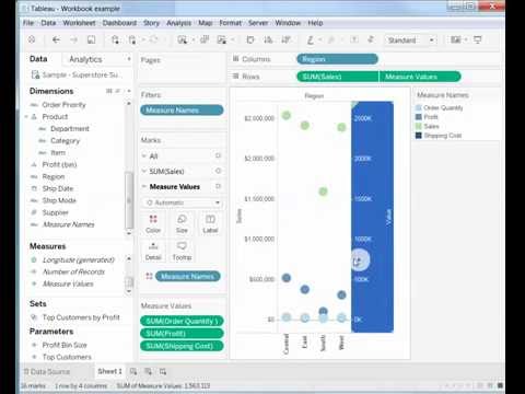
How to Create a Combination Chart That Shows More than Two Measures in Tableau
 0:06:17
How-to Stop Excel Charts from Overlapping Second Axis Columns or Bars
Комментарии