filmov
tv
Effectively Use Column & Row Grids in UI Design (Figma)

Показать описание
-- Today, I'm going to show you an approach for creating layouts with consistent spacing/white space. I will specifically show you how to use row based grids in Figma to ensure equal white space between various elements and sections in your UI designs.
0:00 - Introduction
0:57 - An Awesome Offer
1:34 - Setting up a Column Grid
2:20 - Setting up a Row Grid
4:19 - Navbar Layout
5:25 - Headline & Subheadline
8:58 - Testimonials Section
11:20 - Another Section
13:53 - Final Thoughts
Let's get started!
#uiux #grids #figma
- - - - - - - - - - - - - - - - - - - - - -
Subscribe for NEW VIDEOS!
^-Chat with me and others
- - - - - - - - - - - - - - - - - - - - - -
Come to my discord server or add me on social media and say Hi!
 0:14:34
Effectively Use Column & Row Grids in UI Design (Figma)
 0:10:17
Master Responsive Grids (Rows & Columns) in Figma
 0:05:47
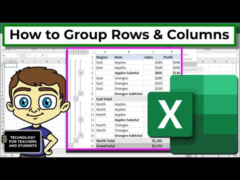
Grouping Rows and Columns in Excel
 0:15:33
What are these ROW/COLUMN functions doing in my Excel formulas?
 0:00:23
How to automatically adjust table columns to fit text in Word
 0:13:22
Excel Pivot Table EXPLAINED in 10 Minutes (Productivity tips included!)
 0:05:19
Must Know Excel Shortcuts: Working With Rows and Columns
 0:10:28
Rows or Columns for Table Design? Master the Ultimate Table Layout Strategy in Figma!
 0:01:31
Add Blank Row or Column in Power BI
 0:00:27
Power BI - Matrix Visualization - move values from columns to rows
 0:00:19
Move columns and rows in Excel, the easy way
![[CVPR 2023] Efficient](https://i.ytimg.com/vi/_gceZhQMc8U/hqdefault.jpg) 0:07:12
0:07:12
[CVPR 2023] Efficient Scale-Invariant Generator with Column-Row Entangled Pixel Synthesis
 0:02:53
Sumif's On Rows and Columns for Excel And Google Sheets
 0:00:41
How To Convert Data in Columns into Rows in Excel Document
 0:08:30
VLOOKUP To Get Complete Record: ROWS, COLUMNS or SEQUENCE Function? EMT 1532
 0:03:12
Everything you need to know about FREEZING rows, columns, and multiple combinations
 0:05:40
Learn to decide the position of Columns in a column layout | Structural planning | Civil Tutor
 0:00:26
Excel Sort Column by Numbers in Ascending/Descending Order (2020)
 0:04:27
How to use columns in Microsoft Word
 0:05:22
VLOOKUP COLUMN and ROW - Handle large data tables with ease [Advanced Excel]
 0:03:26
EXCEL TRICK - Select large data quickly in columns & rows WITHOUT click & drag or unwanted c...
 0:00:34
How to EASILY Switch Columns to Rows in Excel #shorts
 0:04:08
3 Ways to AutoFit all Columns and Rows in Excel
 0:01:27
Excel Quick Tip: Select an Entire Row or Column
Комментарии