filmov
tv
Redesigning A Camping Website in Less Than 10 Minutes | Speed UX/UI

Показать описание
In the 65th episode of Demystifying Design, I'll be redesigning the Georgia DNR campground reservation flow!
The goals of this redesign were to make it easier for users to:
1. Learn more about a camping location.
2. View photos of the campground and surrounding activities.
3. Find a camp spot.
4. Reserve a camping location.
5. Favorite a site to come back and visit later.
6. Access my account menu, settings, etc.
This entire redesign took me about 3.5 hours to complete (over 1 day). Hope you enjoy!
Links from the video:
Important timestamps:
0:00 Introduction
0:14 Style guide & user stories
1:20 Redesign begins!
2:23 Hero section
3:15 Campground information
4:20 Sidebar (blaze it)
4:54 Testimonials
5:06 Campsite search flow
5:40 Single campsite card
6:30 Map view
7:20 Search filters
8:40 Table layout
10:08 Final result!
Music licensed by Epidemic Sound:
Cooking with Friends, by TAGE
Curated Light, by Sum Wave
Jetski, by Billo Boi
Salamanca, by Sarah The Instrumentalist content in this video is intended to be purely transformational in nature.
#webdesign #redesign #design #designer #designchallenge #speeddesign #appdesign #designchallenge #webdesign #learndesign #camping #outdoors
 0:12:05
Redesigning A Camping Website in Less Than 10 Minutes | Speed UX/UI
 0:50:45
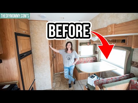
RV Renovation Timelapse from Beginning to End
 0:17:01
My RV remodel on a budget before & after - see the whole transformation!!
 0:18:46
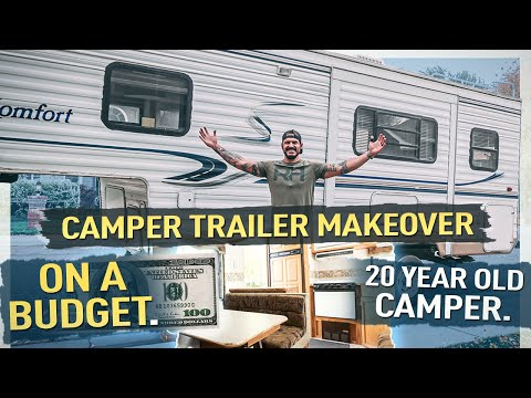
Remodeling a Camper Trailer on the budget
 0:06:37
4 HUGE MISTAKES I Made While Remodeling My Camper Trailer!
 0:15:27
The Best BUDGET Camper Remodel! - Modern Retro Camper
 0:05:11
20 year old caravan renovation, for only £400. Getting ready to move in & start clearing our lan...
 0:11:10
Asking Celebrities If They Remember Me (using fake photos)
 0:00:32
Redesigning My Room: Audrey (and Olivia) | College Room Decor!
 0:14:16
RENOVATED CAMPER TOUR // 18ft travel trailer
 0:21:05
Basecamp Class - Become a Basecamp Pro
 0:08:41
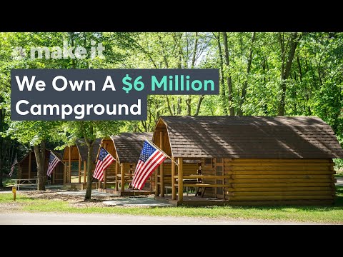
We Quit Our Jobs To Buy A Campground — Now It Brings In $1.2 Million
 0:17:36
RV MAKEOVER+TOUR! (Again! Same girl, different RV)
 0:06:44
$900 POP UP CAMPER REMODEL - MUST SEE
 0:11:23
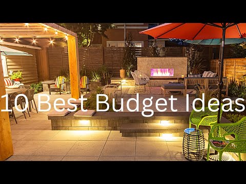
10 Best Landscaping (BUDGET) Ideas
 0:09:21
How to make camping in a pop up more enjoyable | 10 tips to improve your pop up camper
 0:12:48
DIY CAUTION: HOW TO PAINT RV WALLS & CABINETS. We Painted the Interior of our Fifth Wheel! Learn...
 0:09:21
I Survived 50 Hours in 2D
 0:22:41
Vintage Trailer Renovation! — Full Overview Video
 0:11:51
10 Pop Up Camping Tips, Tricks, & Hacks You Won't Find Anywhere Else!
 0:08:11
Custom Budget $400 Travel Trailer Tiny House - Escaping The Corporate Grind
 0:00:59
🚍 Watch & see our transformer-on-wheels! #rv #rvlife #fulltimerv #motorhome #transformers #short...
 0:12:48
I Survived Using Only Minecraft's 'Crafting Guide'
 0:08:43
9 Huge LIES about Living in a Camper Van Nobody Talks About (RV Life)
Комментарии