filmov
tv
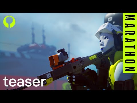
Marathon Art Style Breakdown

Показать описание
This is the definitive break down of the new Marathon art style from what we have seen so far. This would not have been possible without Michael Veselovsky who took my mish-mash idea of talking about Marathon's new art and turned it into a cohesive piece that speaks with a level of authority that is only possible because of his intimate knowledge of graphic design and art. Everything you see and hear is directly from his genius mind and I am so grateful that I have the opportunity to share it with you all on this platform. His script writing and editing are incredible and it is honor to get to work with such a professional dude. Thank you Michael, you rock. I seriously hope you guys enjoy the video and I know it conveys what I think makes this upcoming game so visually special.
If your art appeared in the video but you aren't happy with how you are credited reach out to me and I can put the appropriate links to your stuff in the description. We were not able to find the creator for every piece we used but do not intend to infringe upon anyone's intellectual property!
-Jake
Video Editing/Scripting by Michael Veselovsky
A lot of inspiration for this video came from a thread made by Marathon's art director, Joseph Cross. Link below
The clear stop sign at 02:04 was created by @Stanisslayer. Check out his stuff in the links below!
Brutalist work at 11:45
Road sign on the right side at 02:04
 0:15:30
Marathon Art Style Breakdown
 0:05:12
Marathon | Artstyle and graphic language
 0:02:25
Bungie's Marathon Game Artstyle Unveiled
 0:01:41
Marathon | Official Announce Trailer
 0:20:22
The Runners of Marathon
 0:08:06
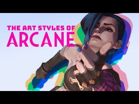
How the Art Style of Arcane Tells A Secret Story
 0:00:17
Artists trying to find a artstyle be like 🎨 #art #artist #drawing #ibispaintx
 0:06:28
Marathon | Bungie's Masterpiece in the making
 0:10:50
Top 100 3D Renders from the Internet's Largest CG Challenge | Alternate Realities
 0:00:37
What is the Marathon? | #marathon #bungie #gamingshorts
 0:59:27
The power of art
 0:00:36
Common Running Form Mistakes 🚫 🏃🏽♂️
 0:11:22
PERFECT RUNNING FORM - 5 Tips ALL Runners Can Learn from Eliud Kipchoge
 0:13:49
DAILY ART STUDIES THAT IMPROVED MY DRAWINGS
 0:00:07
The Expert Guide to Skating break
 0:01:00
Head and neck surface marking
 0:00:17
Chad Face is a cheat code 🗿 @theleanbeefpatty @ImKeithHolland #gigachad #sigma #comedy
 0:01:55
Marathon Trailer Breakdown and Easter eggs.
 0:00:37
The NOTORIOUS MENTALITY! 👊
 0:00:23
What Different Paces Look Like... #running #shorts #barefoot
 0:00:22
Comment yes for more body language videos! #selfhelp #personaldevelopment #selfimprovement
 0:06:38
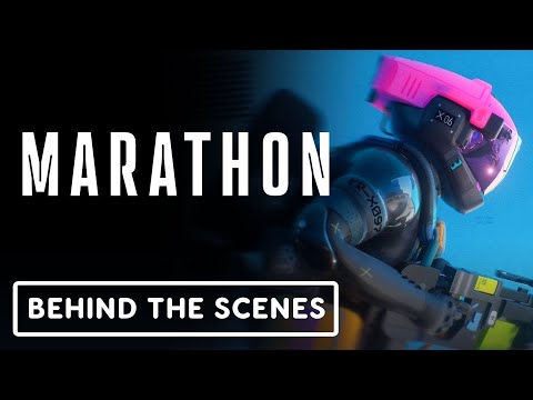
Marathon - Official Behind-The-Scenes Interview Video
 0:00:26
A Clever Way to Study for Exams
 0:00:21
Sprinting like Usain Bolt
Комментарии