filmov
tv
How To Make A Graph On Google Sheets With Multiple Data Sets & Independent Variables
Показать описание
How To Make A Graph On Google Sheets With Multiple Data Sets & Independent Variables
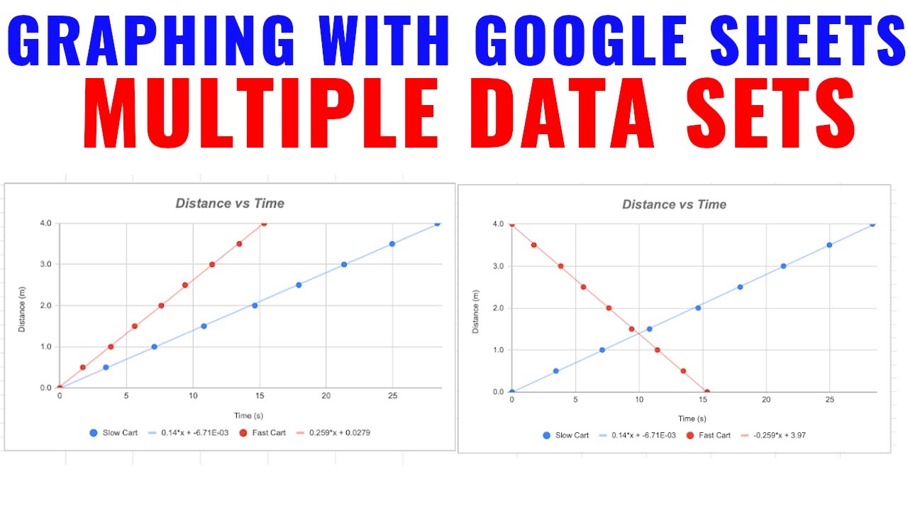
If you are learning how to make graphs on google sheets this video will help. I will show you how to create a chart on google sheets using a data table as well as add a second set of data on the same chart. Google sheets does not allow you to add multiple independent variables so you have to use this to be able to do so. This was used in my physics lab for the velocity of a cart.
💥**THE DATA FOR THIS LAB IS FOUND IN THIS VIDEO**💥
🔥Review Books I Use & Recommend🔥
If there is a topic you want me to do leave them in the comments below.
#physicstutor #mathtutor
DISCLAIMER: The content discussed in these videos are solely my opinion and I have on affiliation with the SAT/College Board or any other products discussed in this video. This channel is for Educational purposes only. This video and description contain affiliate links, which means that if you click on one of the product links, I’ll receive a small commission at no extra cost to you; all of which helps grow the channel! Thank you for your support!
 0:02:36
How To Make A Line Graph In Excel-EASY Tutorial
 0:01:34
How to Create a Graph in Excel
 0:24:31
Excel Charts and Graphs Tutorial
 0:05:25
How to Make a Line Graph in Excel
 0:03:20
How to Make a Bar Graph in Excel
 0:02:40
How to create a Graph in Microsoft Word 2019 (2020 Tutorial)
 0:05:39
Graphing Data by Hand
 0:04:03
How to Make a Graph in Microsoft Excel
 0:03:16
How to Make a Pie Chart in Excel
 0:01:57
Plot Multiple Lines in Excel
 0:07:09
How to make a scientific graph in Excel
 0:02:39
How to Draw a Graph - WORKED EXAMPLE - GCSE Physics
 0:05:14
Making a Simple Bar Graph in Excel
 0:09:19
Excel Quick and Simple Charts Tutorial
 0:02:28
How to create graph in word 2016
 0:06:11
How to Plot a Graph on Word
 0:05:57
Drawing Linear Graphs
 0:04:00
Create Graphs in Science
 0:09:04
How to Make a Line Graph in Excel - From Simple to Scientific
 0:02:46
How to create LINE CHART/LINE GRAPH in EXCEL (Step by Step)
 0:04:00
Bar Graphs for 2nd Grade Kids - Create your own Bar Graph
 0:06:36
Graphs for Kids | Learn all about basic graphs
 0:03:20
Creating Bar Graphs
 0:00:55
How to Create a Standard Deviation Graph in Excel
Комментарии