filmov
tv
AMATEUR VS PRO GRAPHIC DESIGN! (Typography Showdown!!)

Показать описание
More design examples of the before and after style video, this time in the category of typography design. Learn what makes a pro graphic design solution, and what examples end up being amateur in relation to typography in graphic design.
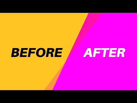
You all really like this amateur vs pro series, and how graphic design artwork can be made better with just quick, minor adjustments. And so I have made a new video but this time it's based around typography. Typography is such an important part of graphic design that it needs to be correct. Bad ore amateur typography can really harm and ruin a graphic design, simply by being incorrect.
Graphic design should be based upon the basics and the fundamental principles. Once these are mastered you can then start to become a pro and find your own style and niche from there on. But understanding and mastering the basics is essential, this is what a lot of amateur designers fail to do, and that's why they never excel up to pro level in their designs or careers. So I hope the examples in todays video do illustrate how graphic design can easily be amateur or pro with small changes.
If you found todays graphic design tips video useful, let me know in the comments section and drop a like on your way out. Subscribe to stay updated to all of my uploads and until next time, design your future today, peace
🔴 Become a PROFESSIONAL designer with this playlist!
🔴 Feel free to buy me a coffee ☕️☕️☕️
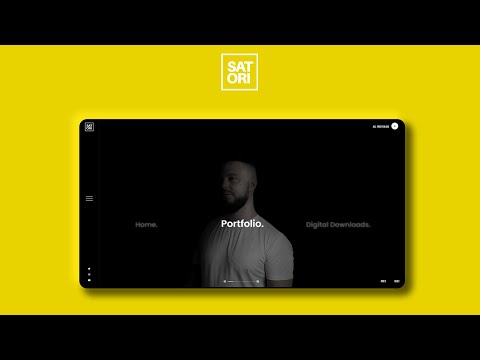
🔴 Digital Downloads & Portfolio Site
📢 📢📢 SUBSCRIBE TO MY CHANNEL
********************************************************************
What Makes A Portfolio PROFESSIONAL?:
Will Ai Take Over Graphic Design??
Only 1% Of Designers Know These Illustrator Tips
********************************************************************
Join Me On Twitter!
Here's My Instagram!
▶ Copyright
The work is protected by copyright. This is applied to the video recording of itself as well as all artistic aspects including special protection on the final outcome. Legal steps will have to be taken if copyright is breeched. Music is used from the YouTube audio library and or sourced with permission from the author
End Screen:
You all really like this amateur vs pro series, and how graphic design artwork can be made better with just quick, minor adjustments. And so I have made a new video but this time it's based around typography. Typography is such an important part of graphic design that it needs to be correct. Bad ore amateur typography can really harm and ruin a graphic design, simply by being incorrect.
Graphic design should be based upon the basics and the fundamental principles. Once these are mastered you can then start to become a pro and find your own style and niche from there on. But understanding and mastering the basics is essential, this is what a lot of amateur designers fail to do, and that's why they never excel up to pro level in their designs or careers. So I hope the examples in todays video do illustrate how graphic design can easily be amateur or pro with small changes.
If you found todays graphic design tips video useful, let me know in the comments section and drop a like on your way out. Subscribe to stay updated to all of my uploads and until next time, design your future today, peace
🔴 Become a PROFESSIONAL designer with this playlist!
🔴 Feel free to buy me a coffee ☕️☕️☕️
🔴 Digital Downloads & Portfolio Site
📢 📢📢 SUBSCRIBE TO MY CHANNEL
********************************************************************
What Makes A Portfolio PROFESSIONAL?:
Will Ai Take Over Graphic Design??
Only 1% Of Designers Know These Illustrator Tips
********************************************************************
Join Me On Twitter!
Here's My Instagram!
▶ Copyright
The work is protected by copyright. This is applied to the video recording of itself as well as all artistic aspects including special protection on the final outcome. Legal steps will have to be taken if copyright is breeched. Music is used from the YouTube audio library and or sourced with permission from the author
End Screen:
 0:08:53
AMATEUR vs. PRO GRAPHIC DESIGNER
 0:11:57
AMATEUR VS PRO Graphic Designs!
 0:08:40
Amatuer / Pro / Master Graphic Design (What It Really Means)
 0:06:30
Amateur Vs Pro Graphic Design [Where MANY People Go Wrong!]
 0:07:23
Amateur / Pro / Master: Graphic Design (Shocking Differences)
 0:11:28
AMATEUR vs. PRO GRAPHIC DESIGNER: Logo Edition
 0:06:16
PRO Vs AMATEUR Graphic Design (Master This)
 0:08:43
AMATEUR VS PRO: Advanced Design Examples (Before & After)
 0:05:40
AMATEUR VS PRO GRAPHIC DESIGN! (Typography Showdown!!)
 0:07:10
AM / PRO / MASTER Graphic Design (What It Really Means)
 0:08:25
AMATEUR vs. PRO Design Class (Before And After Graphic Designs)
 0:05:24
How Amateur Designers Get Color SO WRONG! (Amateur Vs Pro)
 0:06:31
My Designs Were AMATEUR Before Learning These!
 0:05:21
PRO Vs AMATEUR Design Portfolios (With Examples)
 0:10:34
AMATEUR VS PRO: Freepik Designs Improved!! (Before & After Examples)
 0:04:44
Amateur vs Pro Graphic Designer: Creating a T-Shirt Design
 0:21:06
AMATEUR VS PRO: 5 Common Mistakes
 0:05:27
Amateur vs Pro: Advanced UI Design Examples (Before & After)
 0:05:36
AMATEUR vs PRO DESIGN *Technical Aspects*
 0:09:40
EXPERT Vs AMATEUR GRAPHIC DESIGN: Before & After Real Life Examples
 0:06:53
Turning Amateur Designs Into PRO DESIGNS (TOP TIPS)
 0:06:36
AVERAGE TO AWESOME IN SECONDS! 5 Tips For Professional Design Artwork
 0:05:09
AMATEUR Vs PRO LOGO DESIGNERS *Telltale Signs!*
 0:08:19
EXPERT VS AMATEUR: 4 Before & After Design Examples
Комментарии