filmov
tv
Redrawing 5 classic NES sprites at DOUBLE SIZE

Показать описание
I’m curious what would happen if we scale up NES sprites and redraw them, following stylistic cues from the originals - maybe there's new detail that can be uncovered in the higher resolution... let’s find out!
————
0:00 Intro & Doubling Parameters
1:02 Initial Upscale Traces
2:40 Link
3:28 Mario
4:13 Mega Man
5:18 Darkwing Duck
6:29 Samus
7:34 All of them together
8:06 VID OVER
————
Check out my art here:
————
Software used: Adobe Photoshop 2022
————
Title sequence theme music by Failpositive:
Background music obtained through Royalty Free Planet:
Downtown Walk by e s c p
Creative Commons Attribution 3.0
Other background music courtesy of YouTube Audio Library.
————
0:00 Intro & Doubling Parameters
1:02 Initial Upscale Traces
2:40 Link
3:28 Mario
4:13 Mega Man
5:18 Darkwing Duck
6:29 Samus
7:34 All of them together
8:06 VID OVER
————
Check out my art here:
————
Software used: Adobe Photoshop 2022
————
Title sequence theme music by Failpositive:
Background music obtained through Royalty Free Planet:
Downtown Walk by e s c p
Creative Commons Attribution 3.0
Other background music courtesy of YouTube Audio Library.
Redrawing 5 classic NES sprites at DOUBLE SIZE
Redrawing Gwimbly's classic NES sprite
Which Sonic Sprite Is Best?
5 Colors in One Sprite Explained - Audiovisual Effects Pt. 04
Pokémon Sprites Were Made Before The Artwork
Redrawing an NES game! | Samurai Pizza Cats (Kyatto Ninden Teyandee)
Luigi's Sprite Problem
How to Break Paper Mario…
Peter Griffin in Deltarune
revisiting old minecraft textures
INSANE HD Texture Packs For 8-Bit NES Games!
Mario & Luigi NES Sprites Redraw Animation (Part 1) [Reupload]
Mario's Lost Sprite Discovered for Super Mario Bros.
Gen 1 Pokemon Sprites Look CRAZY In Gen 5 #shorts #pokemon
Mario Paint Creations | Sonic the Hedgehog Pixel Art
Did you know that in Super Mario 64...
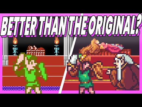
Can We Redraw All of Castlevania NES?
stamped.
Super Sonic Hates the Wisps
Super Mario Bros. 2 (SNES) - Redrawn Characters (Mario)
How we fit an NES game into 40 Kilobytes
Some of these Stardew grandpa mods are so funny #stardew #stardewvalley
Mario Accidentally Killed Luigi At The Nintendo (2023) logo!
Vegeta with Goku’s hair #shorts
Комментарии
 0:08:19
 0:05:16
 0:03:28
 0:08:48
 0:00:19
 0:14:57
 0:01:25
 0:00:32
 0:00:39
 0:00:35
 0:35:12
 0:01:01
 0:02:30
 0:00:36
 0:06:06
 0:00:18
 0:09:31
 0:00:11
 0:00:38
 0:01:00
 0:12:04
 0:00:24
 0:00:10
 0:00:19