filmov
tv
Boxplots in R with ggplot and geom_boxplot() [R- Graph Gallery Tutorial]

Показать описание
In this tutorial I show you how to create Boxplots in R with geom_boxplot() and ggplot().
The examples are based in the R-Graph Gallery. I show how boxplots can be used to visualize multiple different distributions at once. I will also walk you through many different parameters and function arguments that allow you to customize your boxplots in many ways.
⏱ Time Stamps ⌚
0:00 - Intro and video overview
1:31 - Boxplot theory and outlier rule
5:30 - Basic boxplots with geom_boxplot()
6:40 - Function arguments and notching
8:50 - Change the colors of boxplots
9:57 - Highlight a single boxplot
10:54 - Grouping boxplots
12:08 - Adding the average with stat_summary()
12:55 - Adding points with geom_jitter and geom_dotplot
14:06 - Adding boxplots in the margins of a scatterplot
14:36 - Final example and outro animation
External Links:
Background Music:
Outro Animation:
AA-VFX Motion Backgrounds
 0:06:47
Better box plots in R with ggplot()
 0:16:17
Boxplots in R with ggplot and geom_boxplot() [R- Graph Gallery Tutorial]
 0:07:27
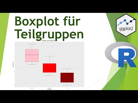
Boxplots für Gruppen mit ggplot in R erstellen - Daten visualisiern in R (23)
 0:19:36
Create a boxplot using R programming with the ggplot package.
![[R Beginners Tutorial]](https://i.ytimg.com/vi/48b4BzxHHH8/hqdefault.jpg) 0:12:09
0:12:09
[R Beginners Tutorial] Plot and customise boxplot using GGPLOT in RStudio . Code included
 0:24:12
Creating Boxplots in RStudio | ggplot library
 0:05:57
Einfacher Boxplot mit ggplot in R erstellen - Daten visualisieren in R (07)
 0:04:15
Boxplots and Grouped Boxplots in R | R Tutorial 2.2 | MarinStatsLectures
 0:26:33
Intro to RStudio & Ggplot
 0:09:29
Making Boxplots using R's ggplot2 Package
 0:00:45
How to create a boxplot in R for beginners #statistics #boxplot #ggplot2
 0:09:33
Boxplots in R
 0:19:49
Using the the ggplot2 R package to create a boxplot with individual data points overlayed (CC091)
 0:08:12
R Tutorial | Creating boxplot and enhance it with ggplot | R Programming
 0:25:16
How to use R and ggplot
 0:03:20
Gruppenweise Boxplots mit Datenpunkten in R erstellen [ggplot]
 0:08:15
Draw Multiple Boxplots in One Graph in R Side-by-Side (4 Examples) | Base, ggplot2 & lattice Pac...
 0:02:15
better box plots in r with ggplot
 0:26:51
ggplot for plots and graphs. An introduction to data visualization using R programming
 0:11:31
R Tutorial: Boxpots with ggplot
 0:07:31
BTEC 400: Building a Box and Whisker Plot in R with ggplot
 0:01:27
Creating Facets for ggplot Boxplots in R
 0:37:31
Master Boxplot Visualization in R with ggplot and ggpubr | Your Ultimate Guide to the ggplot Package
 0:00:24
Boxplot ggplot a plotly en R
Комментарии