filmov
tv
Using the the ggplot2 R package to create a boxplot with individual data points overlayed (CC091)

Показать описание
A boxplot shows the median of a distribution along with the 25th and 75th percentiles as well as an indicator of which points are outliers. In this episode of Code Club, Pat will use ggplot2 with the geom_boxplot, geom_jitter, and stat_summary functions to create a boxplot with the individual data overlayed on the figure.
Do you have a figure that you would like to receive a critique or help improving? Let me know and I'd be happy to arrange a guest appearance!
You can also find complete tutorials for learning R with the tidyverse using...
0:00 Introduction
1:37 Creating box and whisker plot
6:34 Adjusting appearance of plot with alpha
8:15 Overlaying jittered data
11:00 Changing length of whiskers with coef
13:29 Replacing geom_boxplot with stat_summary
16:47 Critique of figure
18:36 Conclusion
#ggplot2 #geom_boxplot #geom_jitter #stat_summary
 0:26:51
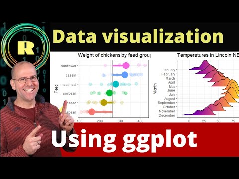
ggplot for plots and graphs. An introduction to data visualization using R programming
 0:05:37
ggplot2 explained in 5 minutes!
 0:29:17
Learn to plot Data Using R and GGplot2: Import, manipulate , graph and customize the plot, graph
 0:18:11
Visualize your data using ggplot. R programming is the best platform for creating plots and graphs.
 0:17:26
Using ggplot to create bar charts for 2 categorical variables. R programming for beginners.
 0:10:30
R tutorial: Creating Maps and mapping data with ggplot2
 0:13:28
How to draw a line graph using ggplot with R programming. Plots and graphs to visualize data.
 0:28:49
GGPlot2 In R Tutorial | GGPlot2 Basics | Data Visualization In R | R Programming | Simplilearn
 0:27:07
Insightful Data Visualization Using ggplot2 in R (Ft. @rappa753 ) | Drawing Advanced Plots & Gra...
 0:36:35
Visualize gene expression data in R using ggplot2 | Bioinformatics for beginners
 0:18:22
Bar charts and Histograms using ggplot in R
 0:07:19
How to plot graphs using Excel csv data in R studio
 0:24:17
Visualizing correlation with double y-axes using the ggplot2 R package (CC235)
 0:15:37
Introduction to R: Plotting with ggplot2
 0:21:57
Visualizing Data in R with 'ggplot2' and 'ggThemeAssist' | R Tutorial (2020)
 0:13:03
Barplot and column plot using R (ggplot)
 0:04:58
R data visualisation : Boxplot using R and GGplot2, plotting data distribution
 0:10:18
Tutorial 3 Histogram Data Visualization using R and GGplot2, plotting data distribution
 0:00:45
3 Simple Tips to Avoid Overplotting in R #shorts #rstats #programming #ggplot2 #datavisualization
 0:03:13
Combine Two ggplot2 Plots from Different Data Frames in R (Example) | Draw Graph of Multiple Sources
 0:28:54
Revisiting and critiquing a scatterplot in R with ggplot2 (CC078)
 1:11:15
Intro to Data Visualization with R & ggplot2
 0:10:24
📊 R Beginners: Master Easy Area Charts with ggplot2!
 0:22:50
Fitting and visualizing linear regression models with the ggplot2 R package (CC237)
Комментарии