filmov
tv
How to use the New Icon Button to create Modern PowerApps

Показать описание
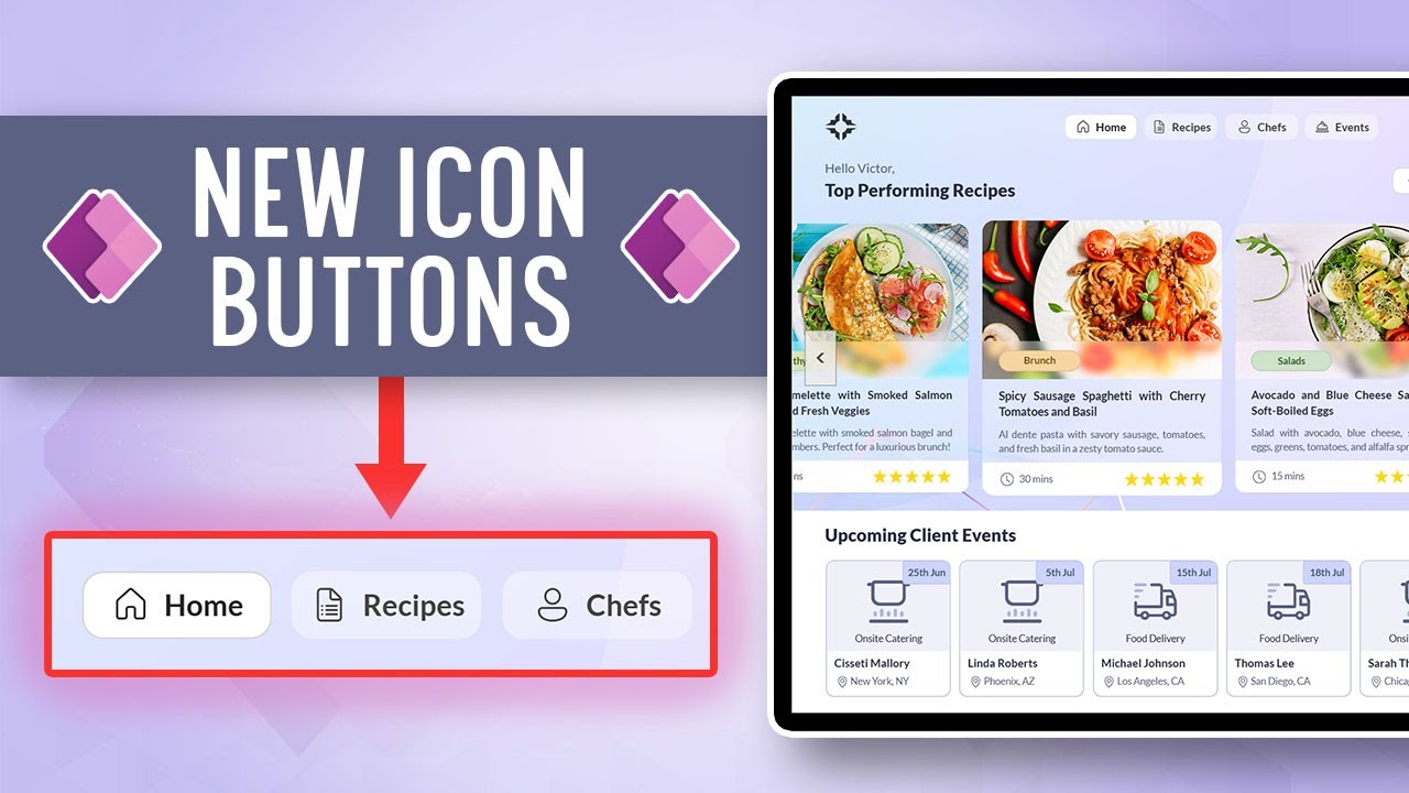
In this video, we cover the updated Modern Button Control. Learn how to add icons to buttons as well as other tips and tricks to use the Modern Button Control to create Modern-looking PowerApps
Video ID: #PP_0016
Table of Contents:
00:00 Intro
00:41 App Intro
01:09 Classic Button Control
02:29 Modern Button Control - Base Structure
05:36 Animated Buttons
09:58 Button Styles and Theme
13:17 Current Limitations
14:52 Specific Fill Modern Buttons
19:43 Transparent Buttons
📥 App and Dataset Download for Members (on Youtube or Patreon):
Members get exclusive access to download the apps, flows, or components featured in this video!
For Patreon Members: Download links will be available on the Patreon Page
For Youtube Members: Check the membership tab on the channel page for the download links.
🎁Not a member yet. Join the Tolu Victor Community:
#powerapps #powerplatform #copilot #moderncontrol #crashcourse #canvasapps #ui/ux #uidesign #button #icon
How to use the NEW Microsoft Outlook!
How to use NEW Microsoft Whiteboard
Roblox Brookhaven 🏡RP NEW VIP PASS UPDATE (130 Props, Secrets, and More)
How to use the New Microsoft Planner in Teams - BASIC Version - [2024]
How to Use the NEW & IMPROVED Excel XLOOKUP (with 5 Examples)
How To Use The NEW Elementor Container | Flexbox CSS
Hurry and Use the New Locker Codes for a Guaranteed Free Invincible Option Pack! NBA 2K24 MyTeam
Laptop Computers : How to Use a New Laptop Battery
Testing Minecraft 1.21 Build Hacks that Actually Work
How to use the NEW Nest Thermostat (2023)
Hamster kombat new game |get more keys bike ride 3D in hamster FAM | Hamster new updates 4 key 🔑
How to use new Espacenet
NEW UPDATE IN BROOKHAVEN RP! (NEW GAMEPASS, CARS AND MORE)
HOW TO USE NEW TATSUMAKI EXPULSIVE PUSH AND HOW TO USE NEW AIR VARIANT | The Strongest Battlegrounds
*NEW* Top 5 Meta Weapons to Use for MW3 Ranked Play
*NEW* DEADPOOL & WOLVERINE SKINS! Fortnite Item Shop [July 26th, 2024] (Fortnite Chapter 5)
HOW TO USE THE NEW #BMW KEY FOR 2023 #shorts #howto
*NEW* TOP 5 BEST GUNS TO USE in MW3 SEASON 5! (Modern Warfare 3 Best Class Setups)
How to Use the New TileMap in Godot 4
How to use the new Bing AI Chat Mode for Better Search Results!
How To Use *New LG Magic Remote
#SHORTS💫 ?? How to Use New Maybelline Age Rewind Concealer || 💁🏻♀️ Caramel Concealer #meghali...
How to use Mahoraga's NEW REWORKED Adaptation
How to Season New Non-stick Cookware before use | Seasoning of Non-stick pans | Anjum’s Kitchen
Комментарии
 0:18:18
 0:07:23
 0:11:56
 0:11:51
 0:13:34
 0:23:57
 0:08:30
 0:00:56
 0:17:33
 0:00:43
 0:02:46
 0:02:21
 0:09:31
 0:00:54
 0:06:34
 0:08:39
 0:00:20
 0:12:20
 0:04:08
 0:07:10
 0:10:25
 0:00:39
 0:01:32
 0:05:58