filmov
tv
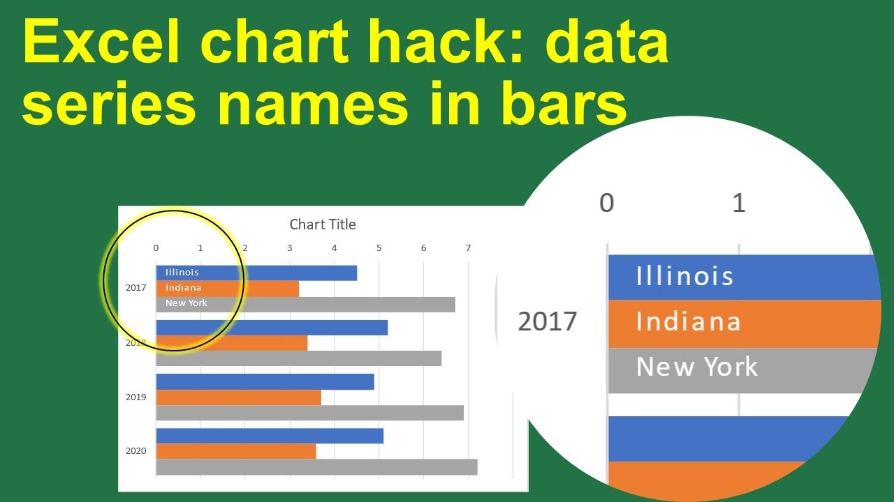
Excel Chart Hack: Put data series labels in the bars of a bar chart instead of the legend
Показать описание
In the video I am using Excel 365 on Windows 10, and most modern versions of Excel and PowerPoint will look very similar. If you like the video, please subscribe to the channel and add a comment below.
0:00 Introduction
0:42 The approach
2:47 Create the bar chart
4:05 Add scatter plot data series
7:01 Set axis scales
8:49 Add data labels
11:26 Adjust label positions
13:16 Wrapup
 0:14:35
Excel Chart Hack: Put data series labels in the bars of a bar chart instead of the legend
 0:24:31
Excel Charts and Graphs Tutorial
 0:07:09
Excel Pie Chart Hack: Add & Style Label Leader Lines
 0:00:41
How to Make a Graph in Excel
 0:14:44
EVG 2023 Excel Chart Hack #3: Use #N/A to hide a data point
 0:00:59
sales report chart for target hit #shorts #excel #exceltips #exceltutorial #exceltrick #msexcel
 0:06:37
EVG 2023 Excel Chart Hack #5: Add a custom text box
 0:00:29
🔴Excel: How to Create Bar Graphs? @ZellEducation @Zell_Hindi
 0:56:03
ILLUSTRATIONS GROUP in WORD | MS WORD TUTORIAL | Live Session #word #msword #eleganceacademy
 0:05:39
Excel Pie Chart Basics: Add & Format Data Labels
 0:00:19
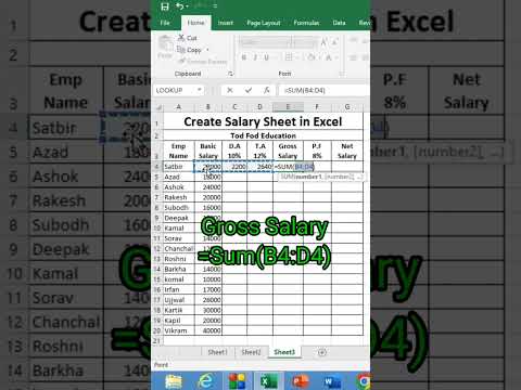
Create Salary Sheet in Excel - Tips & Tricks from @todfodeducation
 0:00:32
How To Separate Data Columns wise / text to columns #shorts #excel #msexcel #exceltutorial #viral
 0:00:16
Excel Hacks | Excel Tutoring Excel Formula for Job Interview Excel for Fresher Excel for Beginners
 0:11:33
Get Ahead With These 10 Advanced Excel Charts!
 0:00:13
Serial Number in excel shortcut || Automatic serial Number in Excel
 0:00:08
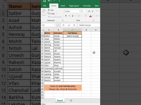
Flash Fill- Full Name- Excel tips & Tricks from @todfodeducation
 0:00:20
How to Autofill Dates in Microsoft Excel
 0:14:52
EASILY Make an Automated Data Entry Form in Excel
 0:00:15
Add Space between Names in Excel | Excel Tips and Tricks | #shorts
 0:00:10
SUM Formula in Excel | Add Total Values #shorts #excel
 1:07:35
Must-Know Chart Hacks in Excel | Stephanie Evergreen
 0:00:28
How to Calculate the Percentage in Excel (Formula)
 0:00:44
Excel Quick Tips - How to create a data table using keyboard shortcuts
 0:00:29
Conditional Formatting in Excel | Highlight Marks Pass/Fail #shorts #excel
Комментарии