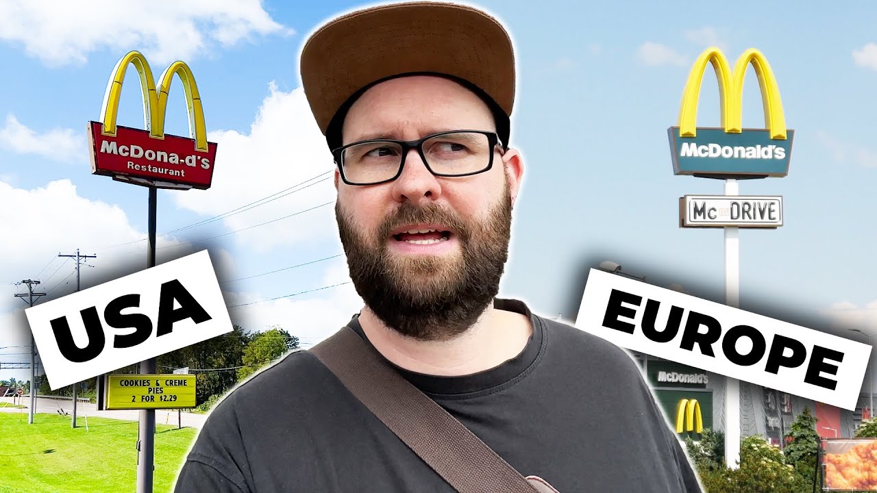
Why McDonald's is green in Europe but red in the US

preview_player
Показать описание
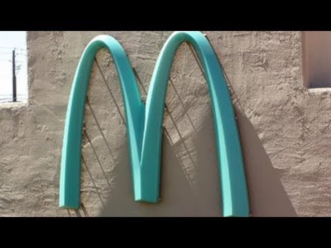
There was a time when McDonald's restaurants all over the globe basically looked the same. And when you saw the huge red and yellow M logo you always knew what to expect. Today the situation is different: In Europe McDonald's buildings look like cafes today - no longer like fast food restaurants. And the company also changed its brand design in many countries: Instead of red and yellow McDonald's today is brown and green. But why? And why is it still red in the USA?

A film by Matthias Schwarzer.

--------------------------------

Sources for the video:

Here is proof that McDonald's in Europe is actually green:

Study about the colour red:

Study about how the brain processes shape and colour:

How the colour red influences our behaviour (Scientific American):

How the colour red warps the mind (BBC):

Why all the food signs are red (Business Insider):

U.S. is top contributor to plastic waste, report shows (Washington Post):

More Europeans are taking climate change seriously. In the U.S., not so much. (NBC News):

--------------------------------

Did you like this video? Support my work on Patreon:

Or become a channel member on YouTube!

--------------------------------

▪️INSTAGRAM:

▪️FACEBOOK:

▪️TIKTOK:

▪️CONTACT:

--------------------------------

Intro song:
MÆT - Start Again

Music:
Epidemic sound

#usa #mcdonalds #europe #fastfood #food
Рекомендации по теме
Комментарии
Автор

If you think that is weird, I noticed for many years the primary colour branding for Honda worldwide is red but in America, it is blue.

MatthiaGryffine
Автор

I was going to comment that in Norway all McDonalds are red. Then I googled pictures of them. And they're all green!!! When did this happen? I have a McDonalds less than 2 km from me and never noticed.

kosefix
Автор

Mc Donald's green??? Live in the Netherlands, wood design yes but never ever saw a green yellow mc Donald's sign. Always saw it red and I googled it and discovered that in my own hometown they all are suddenly green and yellow ...and we have four of them. I have no idea when this happened😅. Either I really don't pay attention to my surroundings or...and I like to think that is the reason ...I started eating healthier and didn't go there that often...:-)

linda
Автор

A correction: Nando is not an american brand but a South African brand, and their food is based on Portuguese Pe-Ri Pe-Ri chicken. The cockerel you see in the brand, is actually based on the Galo de Barcelos, a symbol of Portugal. Red is also the color of our flag, so... yeah... the reason why they have red in the brand isn't just because of marketing but beacause their food being based on Portuguese cuisine.

BrokeBword
Автор

In Italy the MacDonald's burgers are different. The quality of the meat is higher than in the USA and in the last years they introduced some burgers with high quality "Chianina" meat and other Italian ingredients, like Asiago cheese, etc. The problem is that often you will spend as much money as in the restaurant next door...😂

valefur
Автор

The EU get wooden spoons at McDonald's? We get paper spoons in the UK.

grumpyhale
Автор

Very informative. In the UK we actually seem to have a 3-colour system. On the roads they are still red/yellow. In suburban areas they are moving to green/brown. But in the most sophisticated city centre areas, they are black. But as you say, the food is still presented in red packaging, which seems odd.

Interesting that unlike most fast food chains they are adaptable without apparently diluting the brand. I'm not a fan of the company, but it seems that the devil has all the best tunes.

As for health, in Europe the veggie and vegan menu is far more extensive than in the US, where new offerings are only being tested and haven't yet been rolled out nationally.

tullochgorum
Автор

I agree with the idea that the dark green is a themed architecture look designed to match the cafe culture that they are targeting.

mrwoodandmrtin
Автор

I think I might actually have to add something. The green design change might actually come from even earlier than 2009. Because my local McDonalds in Hillerød, Denmark, opened in early 2008, and was the first new McDonalds in Denmark after several years of stagnation, and from the very start had the green branding, new logo, and design elements that are now commonplace across Europe. At the time McDonalds was also getting a lot of public backlash in Denmark as an increased public awareness was put on health and obesity, which hit McDonalds especially hard, making them take a hard diversion into appearing as a healthier food option with stuff like greens and veggies, salads, carrots, juice, and spring water coming onto the menu alongside a corporate rebrand from Red to Green. Interestingly though we didn't get McCafé until very recently.

Since this seems to be the earliest I could find on the McDonalds rebrand, it actually makes me wonder if my very local one might have been the guinea pig for the whole Europe-wide transformation of McDonalds.

Your point on McDonalds being incredibly effective at tailoring marketing to a local market is also very much on point. Here in Denmark they have some very peculiar ads. Like for getting young adults to start work there. McDonalds actually has a program here where a job in a McDonalds restaurant for a few years can actually give a diploma which matches a formal education in the hospitality and restaurant schools. They've also had ads showing some of the store managers, trying to break myths of working at or running a McDonalds restaurant, and more recently they've had ads claiming how sustainable they are, like using frying oil for their french fries that could be reused as biodiesel, or showing the quality and nurture that the potatoes for their fries come from.

drdewott
Автор

Was like "wtf, it's not." And then i look at photos, and it is. WHEN DID THIS HAPPEN?

Ark_knight
Автор

I think you hit the spot
The difference is in culture and Europeans like to sit and enjoy a restaurant

markeeecmarkoni
Автор

Red for heart disease & yellow for vomit, a perfect fastfood combination.

LowPlainsDrifter
Автор

I'm happy that you keep answering all the important questions in life.
Jokes aside, I really like this content. Good job!

markuserikssen
Автор

Interesting that it's mentioned that blue is 'poison' and not something associated with food. In Israel there's blue McDonald's restaurants, which indicate Kosher.

haardkaar
Автор

Packaging of the fries is red in Europe because it has become an iconic piece of design. Just like the pack of Marlboro cigarettes or the can of Campbell soup.

viewwwwer
Автор

The European Union's Audiovisual Media Services Directive has led to the cessation of advertising junk food to children. As a result, McDonald's can no longer depend on children as a primary customer base and must adapt its marketing strategies to appeal to more health-conscious adults.

helloworld
Автор

As an American, one thing I always try to impress on people from other countries is exactly how much capitalism has infiltrated our day-to-day life. A lot of people would love to get rid of plastics, but the various chemical companies and producers won't have it. We also have briber...I mean lobbying.

Wondering_Ghoul
Автор

In Canada McDonald's colours are brown and grey, with red and yellow. Like a depressed adult longing for their childhood. Also our McD's food went from being standard takeout, then adding salads, wraps and delicious toasted deli sandwiches and premium burgers...then back to standard garbage again. Canada is so weird.

cammcbri
Автор

In my country Philippines, McDonald's take their CSR towards the environment seriously. The newer branches, built from 2022, have solar panels, bike lanes (in some branches), and concrete pavers infused with mixed plastic waste to minimize plastic waste in the waters.

spongeotakuph
Автор

1:57 DUDE THATS THE EXACT MCDONALDS I WORK AT 😭

Chase-roip