filmov
tv
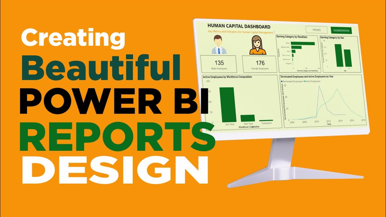
Transform Your Power BI Reports into Stunning App-Like Dashboards

Показать описание
Ready to elevate your Power BI skills? In this tutorial, we’ll show you how to design a Power BI report that looks and feels just like a professional app! Whether you’re creating dashboards for executive presentations or interactive reports for your team, this guide will help you craft a seamless, intuitive user experience.
What You’ll Learn:
Customizing layouts to mimic app-like interfaces
Using buttons, bookmarks, and navigation features for a smooth user journey
Applying modern design principles to make your reports visually appealing
Who Is This For?
Business analysts, data enthusiasts, and Power BI developers looking to take their report design to the next level.
Why It Matters:
A well-designed report not only conveys insights effectively but also enhances user engagement. By making your Power BI reports look like apps, you’re adding a layer of professionalism that sets your work apart.
Subscribe and hit the bell icon to stay updated on more Power BI tips and tricks!
#PowerBI #DataVisualization #ReportDesign #DashboardDesign #BusinessIntelligence
 0:12:46
 0:41:07
 0:20:22
 0:06:21
 0:33:24
 0:30:22
 0:23:03
 0:00:12
 0:08:53
 0:24:56
 0:09:00
 0:06:54
 0:10:17
 0:15:25
 0:10:15
 0:11:32
 0:44:14
 0:12:32
 0:15:10
 0:10:32
 3:02:18
 0:00:27
 0:03:23
 0:16:22