filmov
tv
Introduction to Bar Charts using the Matplotlib Python Library

Показать описание
Introduction to Bar Charts using the Matplotlib Python Library
Matplotlib is a plotting library for the Python programming language and its numerical mathematics extension NumPy.
A bar chart displays a set of categories in one axis and the percentage or frequencies of a variable for those categories in another axis.
While a bar chart can be drawn directly using matplotlib, it can be drawn for the DataFrame columns using the DataFrame class itself.
🌸 Support channel & make donation :
🌸 Link to the website :
🌸 Subscribe for more videos :
🌸 Follow me On Social Media
***********************************************************************
🌸 How to run Python Script in Atom Editor using platformio-ide-terminal
🌸 How To Check Bad Blocks Or Bad Sectors On a Hard Disk In Linux
🌸 Linux How To Partition a Hard Drive Using the Parted Command
🌸 Checking or Repairing a File System using fsck in Linux
🌸 How To Monitor the Health of Your Hard Drive in Linux using SMART
🌸 Linux iotop: Monitor your disk Input/Output
🌸 How To use the “du” (Disk Usage) Command in Linux
🌸 How To View Manipulate System Logs In Linux Using Journalctl Command
🌸 How To Sync And Backup Files In Linux Using Rsync Command
🌸 Linux cURL Command Tips and Tricks
🌸 Linux tail and multitail commands
🌸 Linux How To view Log Files
🌸 How To use the History Command On Linux
🌸 Tips and Tricks How To manipulate Text Files on Linux
🌸 How to Archive, Compress and Extract Files Using the tar Command on Linux
🌸 Linux - How to split larger files into smaller parts
🌸 Linux commands : Top
***********************************************************************
#Matplotlib#Python#Linux
 0:02:47
What is a Bar Chart?
Introduction to Bar Charts using the Matplotlib Python Library
 0:07:49
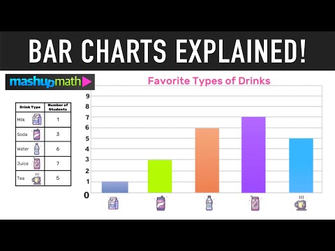
Bar Charts and Bar Graphs Explained
 0:02:47
Introduction to Barchart.com
 0:17:36
IELTS Writing task 1: Bar chart lesson
 0:03:20
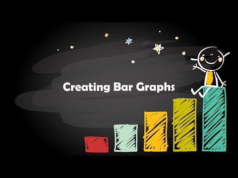
Creating Bar Graphs
 0:29:12
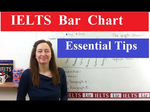
IELTS Writing Task 1: How to describe BAR GRAPHS
 0:04:21
Bar Charts - R: An Introduction - 3.2
 2:06:36
Day 2 - Advanced Data Analysis with EXCEL and Dashboard Creation
 0:05:13
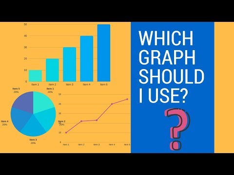
How To Choose The Right Graph (Types of Graphs and When To Use Them)
 0:06:36
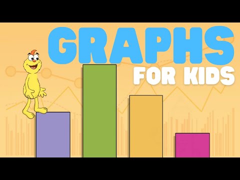
Graphs for Kids | Learn all about basic graphs
 0:12:39
Math Antics - Data And Graphs
 0:04:11
Bar Graphs for Kids (Grade 1 and Grade 2) - Learn How to Read and Interpret Bar Graphs.
 0:01:36
Bar Charts - Intro to Statistics
 0:14:10
Excel Charts & Graphs: Learn the Basics for a Quick Start
 0:04:00
Bar Graphs for 2nd Grade Kids - Create your own Bar Graph
 0:03:10
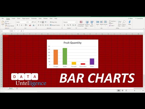
Basic Bar Chart in Excel - Introduction to bar charts - Excel 365
 0:07:35
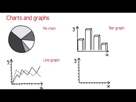
Bar Charts, Pie Charts, Histograms, Stemplots, Timeplots (1.2)
 0:18:26
IELTS Writing Task 1: How to Describe a Bar Chart
 0:43:04
IELTS Academic Writing Task 1 - Bar Charts Lesson 1
 0:13:28
Introduction to matplotlib Python Bar Charts, Annotation & Histograms with Python
 0:03:12
Types of Graphs and when to use them
 0:14:02
Introduction to Column Chart or Vertical Bar Chart in Excel
 0:03:43
How to talk about charts and graphs in English (advanced English lessons)
Комментарии