filmov
tv
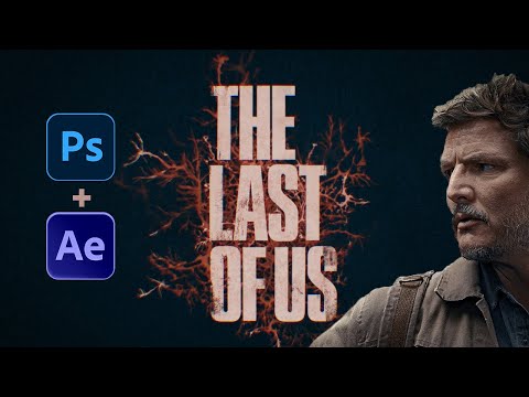
Last of Us Challenge: OLD Art vs NEW Art!

Показать описание
🔥Learn to Create Photoshop Concept Art with Red’s Full Course:
In this full-length tutorial Red will show you how he REVAMPED his old The Last of Us artwork. Is his new piece BETTER or WORSE than the last? You decide! 😲
▶️ MENTIONED VIDEOS
🔥 GET 100 FREE FIGURE STOCKS (Instant Download):
🔥 BEST SITE FOR STOCK PHOTOS + OVERLAYS
🔥 OUR PHOTOSHOP TRAINING COURSES
📸 VIDEO STOCK RESOURCES
🛠️ TOOLS WE USE FOR PHOTO MANIPULATION
💵 LEARN HOW TO EARN FROM YOUR DIGITAL ART
📩 GET IN TOUCH WITH US
⚡ JOIN OUR COMMUNITIES
⚡ CONNECT WITH REDOUANE ON SOCIAL MEDIA
ℹ️ABOUT PHOTO MANIPULATION
We’re a team of Photoshop Artists from across the globe and we’re PASSIONATE about Digital Art and Photo Manipulation. We create Photoshop Overlays and Figure Stocks for the Stock Photography websites Photo Manipulation [dot com] & NeoStock!
Our goal for this channel is to share our love for the Photo Manipulation artform through Project Tutorials, Tips, and Guides, and also to let people know about the AWESOME stock assets we create.
Each Team Member is a (Pro Freelancer) specialist in their respective fields, with expertise in: Matte Painting, Concept Art, ‘Hollywood Processing’, Editorial Design, Book Cover Illustration, Publishing, Portraiture, Photography, 3D, and Environmental Design!
We really hope you enjoy the work we do here. If you got a kick out of today’s video, please do give us a ‘Like’ and Subscribe – it costs nothing to you, and really helps our content reach the audience it will help most 🙂
Wishing you all the best with your creative adventures,
Dean (Founder & CEO of NeoStock LTD and Photo Manipulation [dot com])
#photoshop #tutorial #redouanenaouri
Комментарии
 0:00:39
 0:00:21
 0:00:15
 0:00:20
 0:00:31
 0:00:29
 0:00:51
 0:00:24
 0:00:17
 0:13:06
 0:00:50
 0:00:15
 0:00:43
 0:00:31
 0:06:20
 0:01:00
 0:38:10
 0:00:53
 0:08:04
 0:07:42
 0:00:22
 0:00:14
 0:11:57
 0:00:52