filmov
tv
Easiest Way to Create Dynamic Step Charts with Error Bars

Показать описание
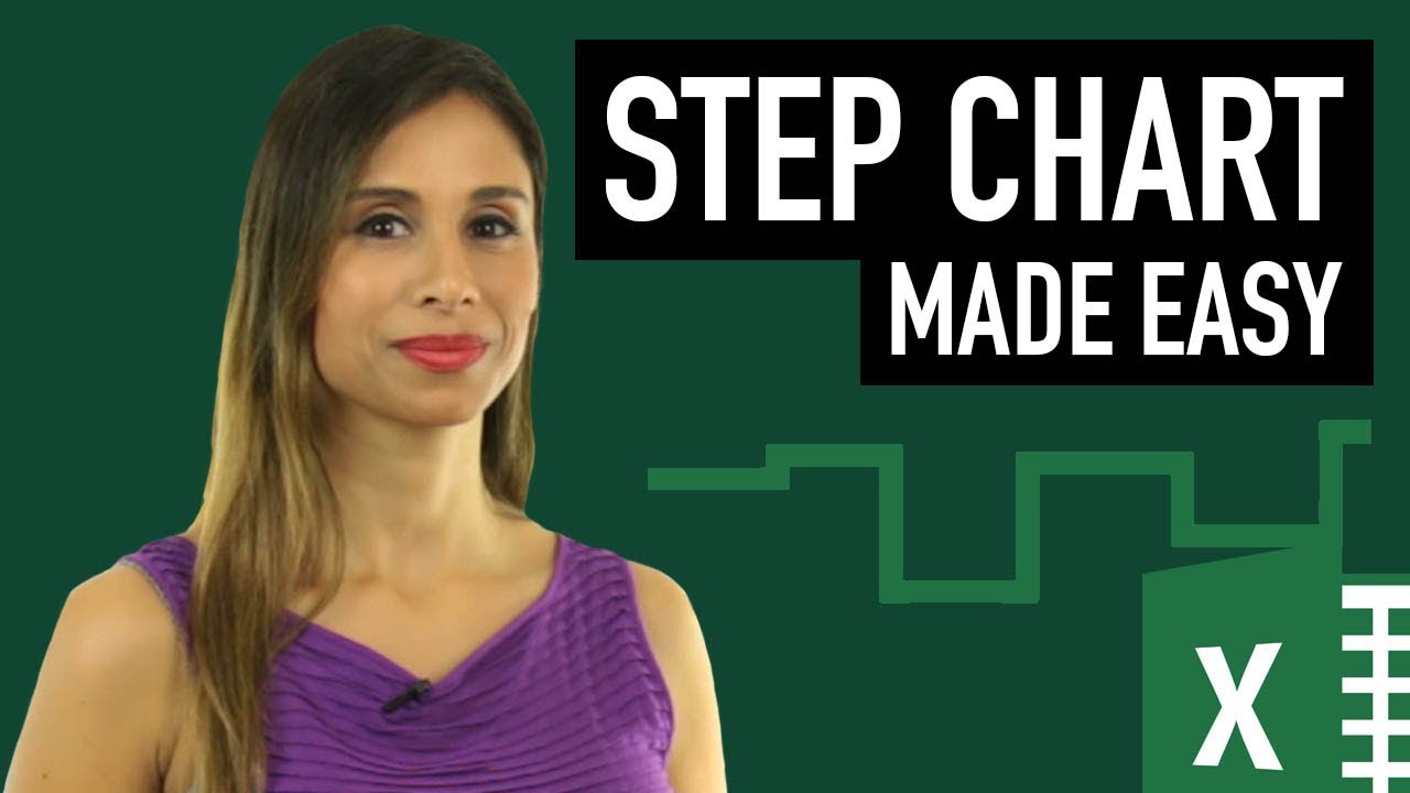
Use this trick to create a super quick dynamic Step chart in Excel using a scatter plot and error bars (great graph to show price & inventory fluctuations).
Key Highlights:
Data Setup and Initial Charting: Converting data into an Excel table and inserting a scatter plot chart.
Applying Error Bars: Utilizing horizontal and vertical error bars to create step chart effects.
Custom Error Bar Lengths: Techniques to dynamically set error bar lengths based on date differences.
Data Label Optimization: Adding data labels for positive and negative values separately for clarity.
Final Visual Enhancements: Adjusting line thickness and color, and formatting the chart for a polished look.
What is a Step Chart? A Step Chart is great for visualizing variables that change on an irregular basis. For example price and inventory changes. If you create a line chart directly on the data set you will realize it doesn't show the correct visualization. There are different ways to get the right visualization. This videos shows you the easiest version. It uses a little chart trick called error bars.
Many thanks to Mehdi & to Bart for providing us with different methods of creating the Step Chart.
★ Links to related videos: ★
🚩Let’s connect on social:
Note: This description contains affiliate links, which means at no additional cost to you, we will receive a small commission if you make a purchase using the links. This helps support the channel and allows us to continue to make videos like this. Thank you for your support!
#excel
Комментарии
 0:18:35
 0:18:16
 0:02:11
 0:06:54
 0:02:46
 0:11:11
 0:19:47
 0:30:37
 0:00:57
 0:10:15
 0:13:03
 0:08:01
 0:32:13
 0:08:12
 0:11:25
 0:03:57
 0:05:23
 0:07:20
 0:08:31
 0:12:26
 0:04:01
 0:17:31
 0:01:51
 0:12:33