filmov
tv
MatPlotLib Python Tutorial in Jupyter Notebooks - Part 1

Показать описание
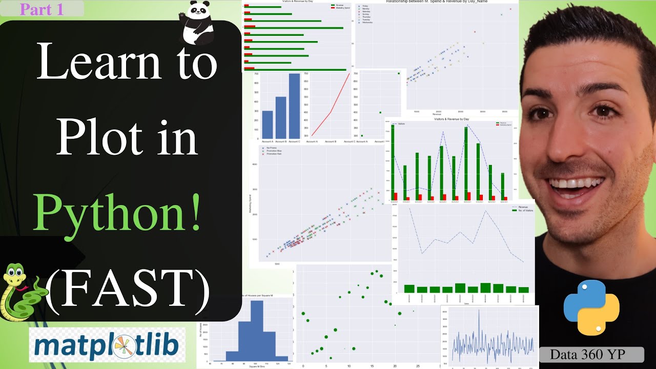
How to create plots in Python (2020). Learn how to get started with Matplotlib. I break down the tutorial into 2 parts; 1) plotting with Numpy 2) Plotting with Pandas. I cover things like; from where to download / create the raw data, how to create different plots (line, bars, subplots, combo, scatter, histogram, etc), how to add titles, legends, labels, tickers, change sizes, change colours and many more!
Support the channel on Patreon:
Data Analytics Course Link:
MatPlotLib Python Tutorial in Jupyter (2020) - Part 1
Tutorial Overview
• What is matplotlib and how/why it's used
Using Numpy
• Line plots using NumPy
• Scatter Plots using NumPy
• Bar plots & Subplots using Numpy
• Histogram using NumPy
Using Pandas
• Line Plots using Pandas
• Combo (Line & Bar) Plots using Pandas df
• Scatterplot Using DFs
• Scatterplots with Legends using Pandas
How to download and install Python through Anaconda:
Raw Data & Notebook:
Yiannis Pitsillides on Social Media:
How to create plots in Python (2020) – Part 1
How to create plots in Python (2020)
How to create plots in Python
Комментарии
 0:27:44
 0:06:43
 1:02:41
 0:09:36
 1:01:30
 0:22:01
 0:34:20
 1:14:56
 4:22:13
 0:15:08
 0:10:20
 1:02:07
 1:34:00
 0:27:25
 0:08:33
 0:09:38
 0:15:46
 0:32:33
 0:25:55
 0:35:01
 12:19:52
 0:02:57
 0:03:54
 0:20:34