Color Spaces Explained! sRGB, Adobe RGB (1998), ProPhoto RGB

preview_player
Показать описание


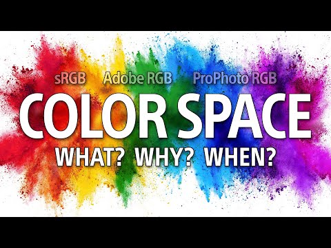
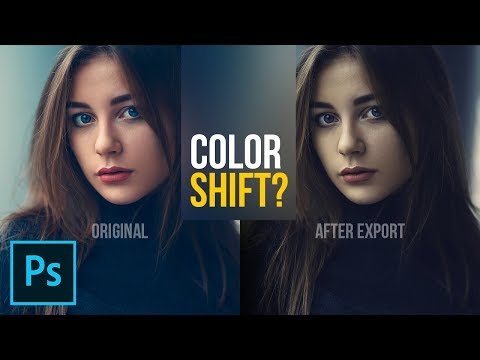
If you've ever exported an image and the colors looked off after uploading it to your website, this tutorial can help! A basic understanding of how color space works in Photoshop can save you some serious time and headache. Today we break down the differences between LAB, Adobe RGB 1998, ProPhoto RGB, and sRGB while offering general tips on how to choose what color space to work in and what color space to use when exporting your final photos.

Download the Sample Image Here:

-

0:57 Brief Background on Color Spaces
1:37 Common Color Spaces
3:04 Color Space Uses
4:32 Color Settings in Photoshop
9:32 Assigning Color Profiles to RAW
12:50 Color Settings from Lightroom to Photoshop
14:08 Color Settings for Export from Lightroom

-

VISIT PHLEARN.COM FOR MORE FREE TUTORIALS

SUBSCRIBE NOW FOR MORE FREE TIPS AND TRICKS

LET'S BE FRIENDS!
Рекомендации по теме
Комментарии
Автор

Color Spaces are tricky business. Follow the guide below to keep your photo's colors as consistent as possible through your workflow!
0:57 Brief Background on Color Spaces
1:37 Common Color Spaces
3:04 Color Space Uses
4:32 Color Settings in Photoshop
9:32 Assigning Color Profiles to RAW
12:50 Color Settings from Lightroom to Photoshop
14:08 Color Settings for Export from Lightroom

phlearn
Автор

In case anyone is wondering: this video is focused on *WEB PUBLISHING* <-- means exporting images for internet viewing in correct color space, which for internet and most mobile devices, is sRGB. Photography editing is done in AdobeRGB, or in special cases ProPhotoRGB, with rendering set at Perceptual, and the resulting image is then exported to whatever color space is needed afterwards. Just remember that if you are sending your materials to pros who will be viewing it on a wide gamut monitor (as most pros do), it is best to leave it in AdobeRGB, which I myself use. As of 2019, there are no monitors on the market which display ProPhotoRGB, but there are companies that make monitors which display AdobeRGB(1998). For example: NEC PA series (up to 2560x1600), and EIZO ColorEdge series (up to 4K).
I edited this comment, because michaelmazzen pointed out to me my error in writing the initial comment.
Cheers!

alainkoningverdraag
Автор

For the first time in years I finally understood very clearly how color spaces work, you made it very clear and simple, great video, thanks!!

nycsonic
Автор

I love this guy's honesty! "Put it in the top adobe! Its not even obvious you can click there!" So many times its not until i see a tutorial that i realize hey thats actually an option to click! *face palm*
PShop is not beginner friendly, thank God for these free tutorials or else I 'd be completely lost .

SVUfannyc
Автор

I think this has cleared up a LOT of misinformation. This question comes up SOO often in Facebook groups and you always get people guessing the answer or giving what is clearly the wrong answer. I personally learnt quite a bit from this and have adjusted some of my settings. A few times throughout i was think "ah but what and within seconds you answered my thought. So well done on the video and well done on apparently reading my mind lol.

matthewbrooks
Автор

This is the best explanation of color spaces I ever found in web. Thanks, Aaron.

bohdanstadnyk
Автор

A million thank yous for this! A complicated concept simply explained.

BreatheDigital
Автор

I was shooting, editing, and exporting all my photos in AdobeRGB. You have saved my proverbial bacon, my friend. Will ALWAYS export in sRGB now in Lightroom. Yikes.. to think what kind of calamity has already happened and would've happened if I didn't watch this vid!

AnthonyRiso
Автор

One of the most useful videos I saw, no crap only professional and well-explained data. Should be 10 times more views..

Pavel__Shin
Автор

Nicely done Aaron. That's a lot of information to cover in a way people can understand. Thanks! However I do have two comments.
First, because I open multiple images at a time in Photoshop which are usually RAW or exported from Lightroom previously as ProPhoto for further editing in Photoshop, I do NOT have my working space as sRGB. That would drive me bonkers. I have the workspace set to ProPhoto. If I set it to sRGB then every file I open would give me a prompt due to the ProPhoto colourspace in the file and the mismatched sRGB workspace. It hurts just thinking about it. My workflow is 100 percent Prophoto until I export from Photoshop for print or web. No prompts appear unless I open a file without a colourspace, which would be something downloaded from the web as you said.
Second, your section on exporting from Lightroom assumed that you would only export from Lightroom for use on the web, thus the sRGB colourspace for export. However many (most?) pro/semi-pro users would do some work in Lightroom on multiple files and then export (save) those files for further editing at some point in Photoshop. Those exports should be in PROPHOTO, not sRGB! If you dumb down the file on export from Lightroom, then you lose all that colour information. Once it's gone it's gone. Opening that sRGB file in Photoshop, even in a Prophoto colourspace, will not get you back all that data you threw away. So I would suggest that there are multiple paths or workflows you could have, depending on how you plan to edit. Maintaining a ProPhoto colourspace ALL through the edits and workflow is very important. The sRGB conversion should be done on that last export for print or web.

jimsmith
Автор

Aaron Stark! Iron Photoshopman! Great and clear tutorial!

DEADLINETV
Автор

thank so much this was the best clearest most comprehensive video for someone who knows nothing about color spaces!

somannifique
Автор

You never cease to amaze me. I got it! Finally taught in a way I could understand. Thank you

htorresstk
Автор

This is one of the most helpful videos I have watched photography wise, if not the most helpful. Excellent.

ChrisW
Автор

In less than 5 minutes I have learned a ton about color spaces, from you Aaron. I was just on the phone with BayPhoto.com because I wanted to print my photos to glass, acrylic, and metal for a comparison of two photos across all three medium respectively.

BayPhoto.com informed me that they print using Adobe RGB (1998), which I didn't know too much about. I was calling them because I also learned that BayPhoto.com and MetalPrints.com are sister companies and when I loaded my images into both websites, one of the images presented differently in the browser; which is what brought up the discussion about "Color Spaces."

learnrhel
Автор

Thanks for this tutorial! It's saved me a bunch of time bringing photos in from LR that were in ProPhoto but didn't play well with an sRGB template I have to use regularly. Now it's set up to ask when transferring over to PS and I can switch automatically to sRGB on import.

DougsDharma
Автор

This is so helpful and well explained. Thanks

nemod
Автор

Excellent, you are always smiling .thanks for everything

fatihakcay
Автор

You are always so clear! I finally got it ! you are great !

lucianarizzi
Автор

Thank you so very much Aaron! Very helpful tutorial!

balamina