filmov
tv
Fast & Easy! McKinsey Chart in Excel. Watch this...

Показать описание
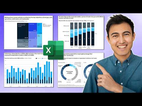
Learn to quickly make professional charts in Excel. These are simple, modern Excel charts that communicate your data clearly and in an engaging way.
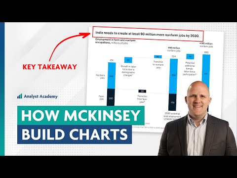
This tutorial shows you how to design charts similar to those used in top industry reports. They fit in any corporate report or consulting presentation. The best part? We use a simple Excel function to create the chart. This is Excel's hidden Chart Function! The method is ideal for improving your business reports with effective visuals, without the need for complex software. Just with a few clicks you'll be able to create an impressive McKinsey chart in Excel. This McKinsey chart is often referred to as the lollipop bar chart or the pin horizontal chart.
You can also use this Excel function to create a super fast bar chart in Excel. Tweak it to create a star bar chart or use any symbol you like. It's so flexible and easy, you'll love this simple Excel hack.
Learn about:
◊ Using the REPT function to customize chart bars with emojis and symbols.
◊ Modifying charts dynamically to adapt to data changes instantly.
For more detailed insights and advanced techniques, check out our full course on Business Charts in Excel. This course is designed to help you create charts that stand out in any professional setting, mimicking the sophisticated styles seen in publications like The Economist and McKinsey reports.
00:00 Use THIS Excel function to Create a McKinsey chart
00:30 Create a Excel McKinsey Chart in 90 seconds
02:24 Customize the Chart
06:49 New Course: Business Charts in Excel
➡️ Join this channel to get access to perks:
🎬 LINKS to related videos:
🚩Let’s connect on social:
This description contains affiliate links, which means at no additional cost to you, we will receive a small commission if you make a purchase using the links. This helps support the channel and allows us to continue to make videos like this. Thank you for your support!
#Excel
Комментарии
 0:10:38
 0:16:47
 0:16:50
 0:10:50
 0:11:49
 0:00:57
 0:08:15
 0:00:54
 0:17:27
 0:01:00
 0:17:17
 0:05:06
 0:28:04
 0:02:25
 0:15:12
 0:14:56
 0:13:55
 0:04:40
 0:04:28
 0:00:15
 0:09:06
 0:09:32
 0:00:46
 0:00:25