filmov
tv
Hierarchy Chart in Microsoft Excel‼️ 📚 #exceltutorial #microsoftexcel #exceltech #motivation

Показать описание
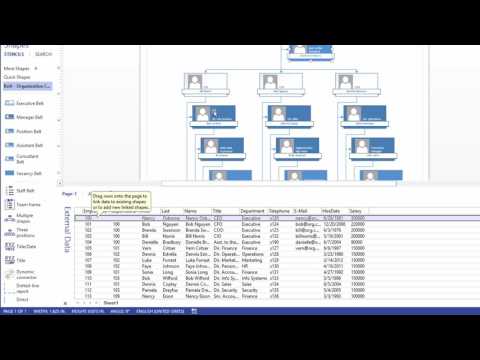
In Microsoft Excel, a hierarchy chart typically refers to a visual representation of hierarchical data using diagrams or charts. It helps illustrate relationships and structures within data sets, making complex information more understandable at a glance.
There are several ways to create hierarchy charts in Excel:
SmartArt Graphics: Excel offers a feature called SmartArt, which includes various predefined hierarchical chart layouts. Users can choose from options like organizational charts, hierarchy diagrams, and process charts. SmartArt allows for easy customization of colors, shapes, and text to represent the hierarchy effectively.
Tree Diagrams: Tree diagrams in Excel are another way to visualize hierarchical relationships. Users can utilize shapes, lines, and connectors to manually create tree-like structures representing hierarchical data. While this method offers more flexibility, it may require more effort to design and maintain compared to SmartArt.
Add-ins and Templates: Additionally, users can explore Excel add-ins or templates specifically designed for creating hierarchy charts. These tools often provide pre-designed layouts and functionalities tailored to various hierarchical structures, such as organizational charts, family trees, and decision trees.
Hierarchy charts in Excel are commonly used in various contexts, including:
Organizational Structures: Visualizing reporting relationships, departments, and roles within an organization.
Family Trees: Representing genealogical relationships and family histories.
Project Management: Mapping out project workflows, task dependencies, and team hierarchies.
Data Analysis: Illustrating hierarchical classifications, such as product categories, organizational levels, or geographical regions.
Overall, hierarchy charts in Microsoft Excel serve as powerful tools for presenting hierarchical data in a clear, structured, and visually appealing manner, aiding in decision-making, communication, and analysis tasks.
#excel #exceltips #exceltricks #spreadsheets #corporate #accounting #finance #workhacks #tutorial #sheets
 0:00:36
 0:09:41
 0:00:57
 0:07:48
 0:00:38
 0:00:53
 0:01:00
 0:00:55
 0:00:35
 0:00:32
 0:00:53
 0:14:47
 0:04:01
 0:00:45
 0:07:21
 0:00:59
 0:04:30
 0:13:54
 0:00:18
 0:00:43
 0:01:16
 0:05:51
 0:23:11
 0:00:36