filmov
tv
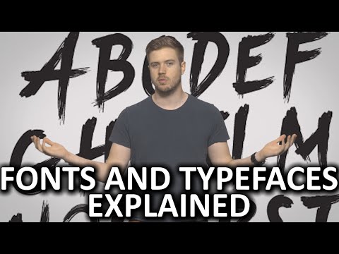
How one typeface took over movie posters
Показать описание
Why Hollywood kept using Trajan.
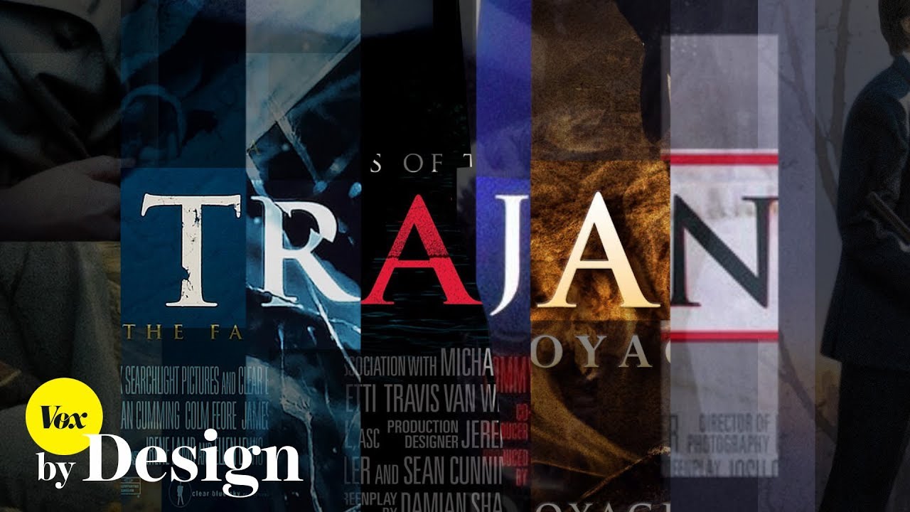
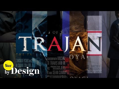
For the past 25 years, one typeface has dominated Hollywood typography: Trajan. It’s everywhere, from Shakespearean epic classics like Titus to gory modern flicks like The Human Centipede. It was even the official typeface of the Academy Awards for a while. In movie poster design, if you want to make a film look official, you use Trajan. So how did that happen? Designer Yves Peters set out to answer that question.
For the past 25 years, one typeface has dominated Hollywood typography: Trajan. It’s everywhere, from Shakespearean epic classics like Titus to gory modern flicks like The Human Centipede. It was even the official typeface of the Academy Awards for a while. In movie poster design, if you want to make a film look official, you use Trajan. So how did that happen? Designer Yves Peters set out to answer that question.
 0:03:52
How one typeface took over movie posters
 0:14:27
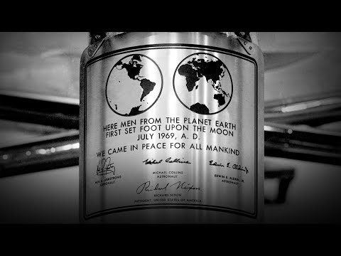
How a typeface helped launch Apollo | Douglas Thomas
 0:10:21
Why this font is everywhere
 0:48:29
The Typographic Legacy of Microsoft
 0:15:51
Typography and Authority: How a Typeface Helped Launch Apollo | Douglas Thomas | TEDxSanFrancisco
 0:07:26
The Font That Makes Everyone Read Faster - Cheddar Explains
 0:27:46
Typographics 2016: Take One Typeface, Fiona Ross
 0:00:50
The difference between a Font and a Typeface 🔤
 1:00:54
FONTOLOGY: The Art and Science of Fonts in Design
 0:00:47
UI Tip: Use one typeface
 0:01:00
Douglas Thomas - How a typeface helped launch Apollo #shorts #tedx #design #typography #space #NASA
 0:08:12
The 8-bit arcade font, deconstructed
 0:12:10
Walbaum—The Man and the Typeface
 0:00:41
What is really the difference between a font and a typeface
 0:39:03
The Ultimate Guide to Typography | FREE COURSE
 0:06:05
What are Fonts and Typefaces?
 0:00:33
The difference between font and typeface. #typography #visualdesign #design #ixdf
 0:11:09
The importance of typeface design | Agyei Archer | TEDxPortofSpain
 0:08:33
Where the 'comic book font' came from
 0:01:00
Making a Typeface
 0:12:59
Aptos Unveiled: Microsoft's New Typeface | In-Depth Designer Review & Comparison with Calib...
 1:07:05
How To Create A Typeface With Debi Sementelli and Laura Worthington
 0:07:36
How To CHOOSE FONTS For Your Designs
 0:01:04
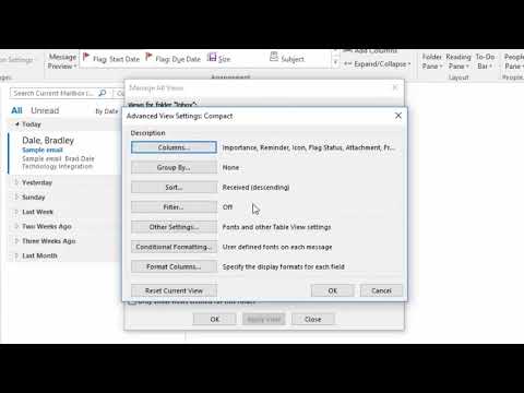
How to change the font size and font style quickly in Microsoft Outlook
Комментарии