filmov
tv
Precedence Diagramming 1 - Arrow Diagramming Method

Показать описание
Precedence Diagramming - Arrow Diagramming Method
Get a certificate with our online courses on
03:00 - Introducing the content of the 3 videos
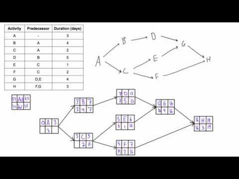
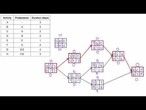
02:30 - The activities, precedence, and duration
03:43 - Drawing the Arrow Diagram or PERT
10:15 - Calculating Start and End Times of the activities
This is the first video in a series of 3 about precedence diagramming and scheduling. In this short series, we will look into the arrow (ADM) and precedence diagramming methods (PDM), the different ways to complete the calculations, and draw the Gantt chart.
In the first video, I will explain how to draw the arrow diagram using the precedence information from the table and calculating the start and finish times of the activities.
In this method, the activities are represented on arrows and each arrow has one start and one finish node. These nodes are event nodes and they show the start and the end of the activity.
The first event node starts at time 0 and corresponds with the start of the project. The last node is the end node of the project. Each schedule has one start and one end node.
The calculations are done on a time scale and start at 0. It is best to compare with a time scale and chronometer where the counting starts from 0.
The ADM has to follow specific rules and the calculations are not as easy as the more recently used PDM. A specific characteristic of the ADM is that there can be dummy activities to show precedence information. Dummy activities have a duration of 0.
Subscribe to this channel for more Project Management, Financial and Business content, and leave a comment below if you have any questions.
Website:
Follow me on FB for more Project Management tips and tricks:
#PMP #ProjectManagement #DeCeusterAcademy
Get a certificate with our online courses on
03:00 - Introducing the content of the 3 videos
02:30 - The activities, precedence, and duration
03:43 - Drawing the Arrow Diagram or PERT
10:15 - Calculating Start and End Times of the activities
This is the first video in a series of 3 about precedence diagramming and scheduling. In this short series, we will look into the arrow (ADM) and precedence diagramming methods (PDM), the different ways to complete the calculations, and draw the Gantt chart.
In the first video, I will explain how to draw the arrow diagram using the precedence information from the table and calculating the start and finish times of the activities.
In this method, the activities are represented on arrows and each arrow has one start and one finish node. These nodes are event nodes and they show the start and the end of the activity.
The first event node starts at time 0 and corresponds with the start of the project. The last node is the end node of the project. Each schedule has one start and one end node.
The calculations are done on a time scale and start at 0. It is best to compare with a time scale and chronometer where the counting starts from 0.
The ADM has to follow specific rules and the calculations are not as easy as the more recently used PDM. A specific characteristic of the ADM is that there can be dummy activities to show precedence information. Dummy activities have a duration of 0.
Subscribe to this channel for more Project Management, Financial and Business content, and leave a comment below if you have any questions.
Website:
Follow me on FB for more Project Management tips and tricks:
#PMP #ProjectManagement #DeCeusterAcademy
 0:13:07
Precedence Diagramming 1 - Arrow Diagramming Method
 0:02:45
The Precedence Diagramming Method - Key Concepts in Project Management from the PMBOK
 0:04:15
How to draw a CPM network diagram
 0:07:26
Use forward and backward pass to determine project duration and critical path
 0:06:57
Project Scheduling - PERT/CPM | Finding Critical Path
 0:09:08
Example - Part 1: Activity on Arrow (AOA) Method
 0:11:19
Precedence Diagramming Method (PDM) [Part 1]: Early and Late Start/Finish (ES, LS, EF, LF)
 0:07:01
CPM vs PDM network diagram example
 0:04:26
Dummy Activity in Network Diagram | Project Management | How to draw a dummy activity? | H K Patel
 0:04:31
Project Management: Finding the Critical Path(s) and Project Duration
 0:16:35
CPM in Project Management & Operations Research | How to do a Critical Path Method
 0:02:56
How to Use the Precedence Diagram Method (PDM)
 0:04:54
Practice Drawing Activity on Arrow Diagrams - Construction Scheduling
 0:22:08
How to draw precedence diagram in project scheduling - Example 2 (part 1)
 0:00:37
How to draw a Network from Precedence Table ?
 0:06:38
Example - Part 2: Precedence Diagram Method (PDM)
 0:08:05
Network Diagram Project management | Activity on node vs Activity on arrow | AON vs AOA
 0:04:36
How to Draw a Gantt Chart - Example #1
 0:05:38
Determine the Early Start (ES) and Early Finish (EF) of activities in a PDM network diagram
 0:11:54
Precedence Network Diagram (A-O-N) Example with Lag and Lead Time
 0:09:08
Precedence Diagramming 3 - Adding all on the Gantt Chart
 0:05:54
Precedence Diagramming Method
 0:10:37
Precedence Diagramming Method (PDM)
 0:07:14
Determine Total Float & Free Float (AKA 'Slack') of activities in a network diagram
Комментарии